

.png)


 Subscribe
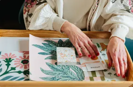
Decorating a space gives it a completely new feel, even if it’s just changing the colour of the woodwork. You can make it feel cleaner and airier; or darker and more intimate. There’s so many options that you could go for so we’ve spoken to our friends at COAT Paints who have done the hard work for you, bringing you some of the current top paint colour trends.
COAT Paints creates the top on-trend paint colours and have a curated palette of 56 colours, making it that bit easier to find your perfect shade. We spoke to Aaron Markwell, COAT’s colour guru to get the low down on what’s hot this year and what to pair them with.
Want 5% off our favourite climate friendly paint brand? Use our exclusive code 'MBR5' to get 5% off COAT paint
First up, we're going green
.png?width=600&height=884&name=pasted%20image%200%20(2).png)
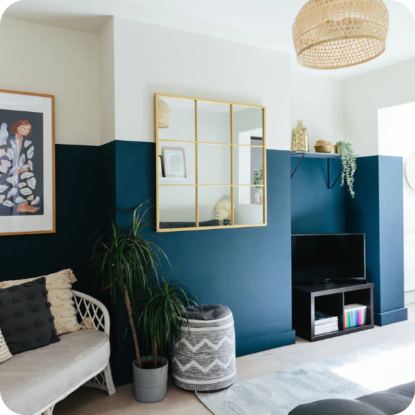
Park Life by COAT Paints. Image credit:@apartmentapocathecary
Green is one of our favourite wall paint ideas. The idea of bringing the outdoors in has been around for a while and it’s not going anywhere. Greens are harmonious with the world outside and we all need a bit of that right now, so COATing your walls and getting your fingers green is definitely the way to stay ahead. We love the way greens reflect the natural world, it gives you the chance to bring life and growth into your home.
Sage greens like Park Life and Yard Party have become an extremely popular choice. We’ve seen a lot of people use these lighter grey-greens as alternatives to white recently. With an increasing awareness of the benefits of spending time in nature, these greens help create a calming effect that is perhaps lost with a shade of white.
If you love green, but don’t want to live in a completely green room, The Trail is a colour you’ll love to wander into. A restful green grey, it’s a clean neutral with a green undertone, making it a lifting addition to your space. Combine with deep wood tones like wenge and rosewood, brass accents and natural linen tones for a Japandi scheme with added depth.
The new found love for sage does not mean that dark greens have been put in the corner, deeper tones like Mansard and Nomad continue to be classics and will make your friends green with envy.
Lucy: "We've seen a huge increase in people wanting to introduce green into their home over the last few years and it seems to be almost replacing the blues. I don't know whether it's people wanting that link to the outdoors, biophilic design and people being stuck in their houses over the last couple of years!
Aaron: "Exactly - it's that element of bringing the outdoors in which makes your home feel more welcoming. Also because green isn't a cool colour because it has that yellow pigment in it.
Because of this demand, we've introduced three new greens to our palette, the most popular of which is 'The Trail' which is this gorgeous mid grey, green. It's fairly deep which makes it versatile but because it's so grey it's quite neutral."
Lucy: "With greens, they really are so versatile like you talked about - the sage greens and The Trail here which is quite a bit lighter - these shades of green work well with contemporary interiors, they look beautiful next to birch ply and those Scandi tones."
Aaron: "Yes, there are so many more green ply kitchens lately!"
Lucy: "Absolutely - we're seeing people be bolder with their colour choices in their kitchens which is lovely - it's not just all white gloss! We saw the trend for navy blue and grey toned kitchens and now we're seeing a lot more green. The really lovely deep greens like Nomad but also these lighter ones which pair beautifully with marble, terrazzo, ply and raw timber finishes as well. We're seeing green used in so many different places in the home."
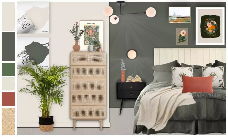
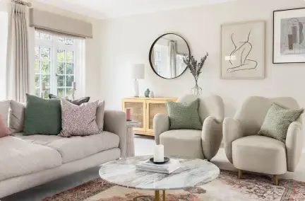
Image credit: My Bespoke Room
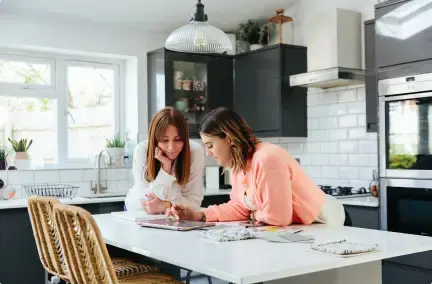
Let us help you choose the perfect room colour. Book a free call today:

How to work with the new neutrals...
.png?width=600&height=800&name=pasted%20image%200%20(1).png)
Cargo by COAT Paint. Image credit:@18thhomeonthestreet.
The COAT community are big fans of a neutral shade and can’t get enough of them. So we don’t need to talk about the obvious timelessness and versatility of neutral shades. Easy, no stress, reliable and nuanced enough to be interesting. They can shine in their own right to create calming spaces, or provide the perfect backdrop for other elements of the room to shine - like furniture or artwork.
Although we have seen a lot of people experimenting with colour wall paint ideas , neutrals will by no means be taking a backseat. Instead, there will be a shift towards earthy neutrals, creating a cosy and friendly environment that you’ll never want to leave. Think warm beiges, greeny greiges, plaster tones and taupes all making another round of the interiors gamut.”
Cargo is a highly anticipated neutral paint colour idea, as it is a green and yellow undertoned greige. This versatile colour lends itself to both the japandi and biophilic design movements, and is a sure match for those of you who like green, but don’t want to commit to a saturated sage or deep, duck green. The best backdrop for all things nature inspired: think linens, tanned leathers, teak mid-century furniture.
Lucy: "We're seeing a real interest in the warmer neutrals coming into people's homes, so that Japandi style and also Biophilic design as well so it's lovely to see a colour like 'Margo'.
Aaron: "Yes, Margo is a grey neutral essentially. There's a little bit of yellow in there to keep it warm. It's slightly mid toned - I like to call this the colour of nothing! Mainly because it fits with everything and works really well with wood tones in schemes with 'Big Timer' which is one of our new warmer greys as well but also it fits with our existing palette like 'Sweat pants' as well. It creates a really harmonised grey scheme that has a little bit of yellow in there which is a bit warmer but still clean. It doesn't have that browny undertone that the taupe's have but not too blue as well."
Lucy: "Yer I think it's a really lovely colour to work with. It works really well with that Japandi style and a slightly monochromatic scheme but it hasn't got the coldness of some of the greys and beiges.
We have lots of clients come to us and say they want to play it safe with a neutral interior! I think people think it's the easy option but oh my word, there are so many neutral paint options out there."
Aaron: "Yer, it's not the safe option at all - if anything, neutrals are a danger zone! Particularly with some of these east facing rooms where your house is north-east facing which is very difficult light conditions - it's bluer, greyer and greener lighting conditions which makes some of these colours like too browny. Particularly 'Cold Brew' for example which is lovely with 'Margo' in a South facing room, this would create a wonderful low light for book cases and things like that. But in an east facing room where the light is bluer it's going to go really brown. There's always that balance with how you pair these colours in different lighting conditions.
For east facing rooms I'd tend to go for more greeny aesthetics to embrace the energised light you get in the morning and they it turns deeper and more beigey in the morning."
Hear more about some of our designers' most loved paint colours in our blog here.
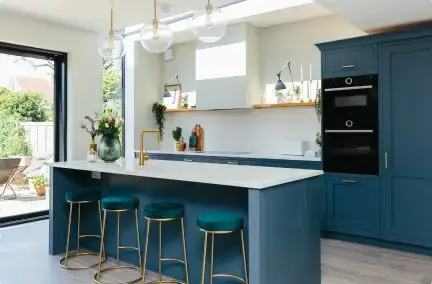
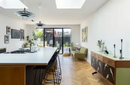
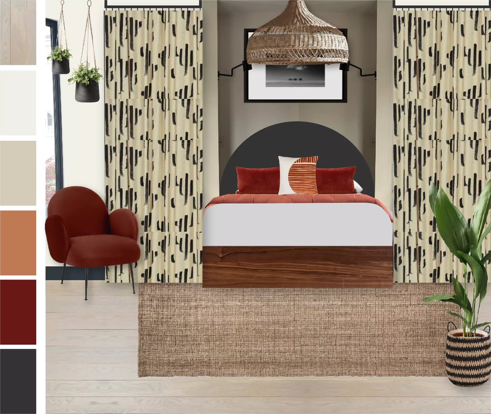 Image credit: My Bespoke Room
How to go big and bold...
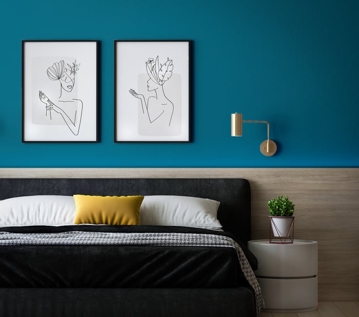
The Posh Seats by COAT Paints
Blue is usually associated with relaxation and peace and this is certainly the case with light, paler blues which have been popular for years. However, recently we’re seeing something a bit different, a new sense of joy and freedom is being expressed via vibrant blue tones and bold patterns.
The Establishment is the first dark blue we've released that doesn't contain any green pigment. It's the most stable blue in our palette because it doesn't have any undertones apart from grey. This means it will work under any lighting conditions, making it a really versatile colour.
For braver decorating fans who want a blue, there’s another corker in COAT's new palette. The Posh Seats is an indulgent peacock blue paint colour. Its slight green undertone adds a subtle touch of warmth. It’s brazen and regal, and really does show off! Use black frames around pictures on The Posh Seats walls, which tricks your eye into thinking it’s a brighter colour than it is. Also denims, grey linens and plush midnight and navy's work really well in combination with this bold blue!”
Lucy: "We've found clients have become way more bold in their colour choices for their home - a lot of them are open to going bold on the walls and introducing a dark paint colour."
Aaron: "Yes and we're seeing that in our colour consultations at COAT, I think people are embracing the darkness!"
Lucy: "Absolutely! I think 'The Establishment' is such a great colour for that because you can be bold but it's still fairly safe."
Aaron: "The Establishment is a super familiar blue with grey pigment - really popular over the last 15 years in kitchens and on feature walls. I think we're now seeing a move to something that's a bit more daring in it's usage - people are now painting their whole rooms in these colours and not just their chimney breast for example which I think is great."
Lucy: "And sometimes the ceiling!"
Aaron: "Yes exactly. It's a really stable colour because of it's pigment. It's not as vivid as some of our new bolds like 'The Posh seats' which is a peacock blue with a bit of a green undertone in there making it more vibrant. 'The Establishment' is a bit more stable and relaxed making it an easier colour to work with which is important."
Lucy: "We see so many colours that go with this from the mustard colour here, 'House points' - that works really well as many of our clients are drawn to mustards with blues. It also works well with greys and monochromes with a pop of brass - that works really well."
Aaron: "It definitely needs that warmth through something brassey or yellow as we know, blue is a fairly cold colour. Adding in yellow gives it more of a luxe vibe."
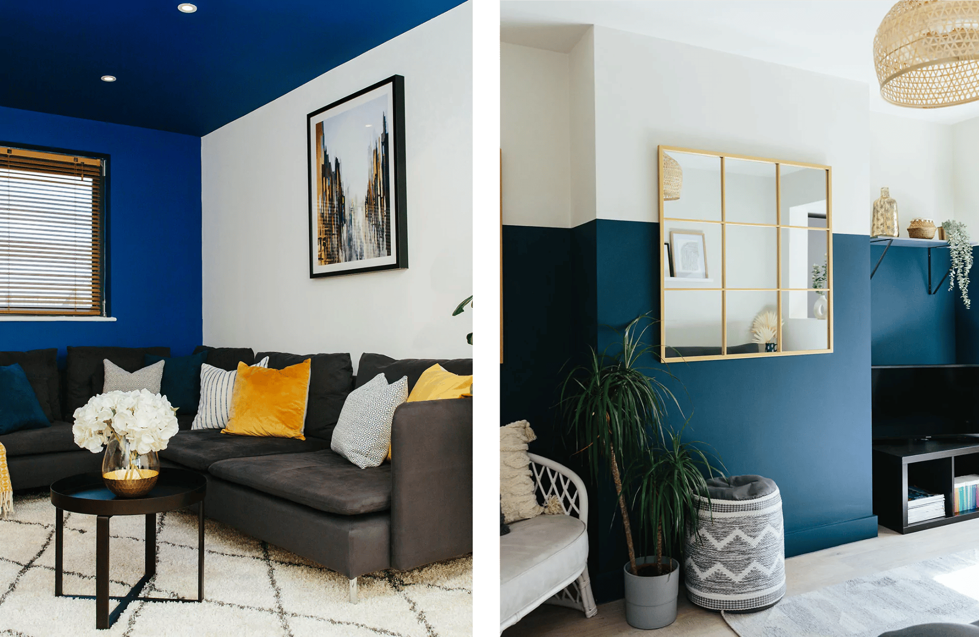
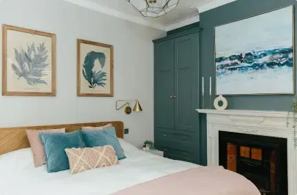
Image credit: My Bespoke Room
Looking for feature wall paint ideas? Bold colours can make a great feature wall in your room, whether you're painting the ceiling or creating a three-quarter wall, the colour can create depth and interest. Learn more about how to create a three-quarter wall by following our guide here.
Completely overwhelmed by colour options?! Book a room design for just £395 to transform your space:

-1.png?height=300&name=Untitled%20design%20(16)-1.png)
-2.png?height=300&name=Untitled%20design%20(15)-2.png)