

.png)


 Subscribe
We all know the saying, "New year, new you!" But what about "new year, new home"? No, we’re not suggesting you pack up and move house (unless that’s already on the cards for 2025). Instead, we’re talking about breathing fresh life into your space—new vibes, new pieces, new colours, and of course, new trends!
Interior design trends reflect the ever-changing needs of our busy lives, and as design experts, we adore watching how they evolve year after year. And while we always encourage our fabulous clients to stay true to their personal style rather than chasing trends, there’s something undeniably exciting about exploring what’s next in the world of design—and perhaps embracing a trend or two along the way.
We may not be able to tell the future at My Bespoke Room, but our designers definitely have a knack for spotting what's brewing in the world of design and what our clients are yearning for. So, we've asked them what they predict will be all the rage in 2025 and have also accumulated their tips on how to pull off some of these stunning and ingenious trends.
Whether you're a fad follower or an interior maverick, it is undeniable that these design ideas are just a little dreamy, and there is no harm in following a trend once in a while if it is something you adore!
The biggest interior trends of 2025
Interior trends taking a decline in 2025
How to incorporate trends in your home
Whether you love trends or timeless design, we’ll help you create a home that’s perfect for you. Book your free consultation with an expert designer to discuss your ideas!

The top colour of 2025
Palettes rooted in nature and neutrals

If 2025 had a mood board, it would be bursting with colours that feel fresh, grounding and just a little daring.
.png?width=100&height=100&name=Quote%20image%20(19).png) "This year, we’re going to see deep greens like forest and olive, paired with calming blues that echo the tranquillity of water and sky," says Interior Designer, Nardus. "These shades help us reconnect with nature and create serene, soulful spaces. Plus, they’re stunning with natural textures like wood and stone."
"This year, we’re going to see deep greens like forest and olive, paired with calming blues that echo the tranquillity of water and sky," says Interior Designer, Nardus. "These shades help us reconnect with nature and create serene, soulful spaces. Plus, they’re stunning with natural textures like wood and stone."
But that’s not all— Interior Designer, Sarah is expecting to see a touch of timeless neutrals too..png?width=100&height=100&name=Quote%20image%20(10).png)
"I’m loving shades of taupe, beige, and soft browns for 2025. They’re versatile, warm, and when paired with sustainable materials and rich textures, they make the perfect backdrop for any style. Think classic but never boring."
 Paint colour Messel no.29. Image Credit: Mylands
And if you’re ready to crank up the drama? Interior Designer, Laura is predicting to see some bold, warm and earthy tones.
-1.png?width=100&height=100&name=Quote%20image%20(250%20%C3%97%20250px)-1.png) "People’s colour confidence is growing. Those earthy tones we already love are going to be dialled up, becoming deeper and richer. Think toffees and clay hues paired with sumptuous fabrics like velvet. These shades tie into the quiet luxury trend that was loved so much in 2024, creating spaces that feel cosy and refined. To balance them out, jewel tones need to be sharp and clean. Messel from Maylands is going to be everywhere in 2025—it’s vibrant, fresh, and totally fabulous."
"People’s colour confidence is growing. Those earthy tones we already love are going to be dialled up, becoming deeper and richer. Think toffees and clay hues paired with sumptuous fabrics like velvet. These shades tie into the quiet luxury trend that was loved so much in 2024, creating spaces that feel cosy and refined. To balance them out, jewel tones need to be sharp and clean. Messel from Maylands is going to be everywhere in 2025—it’s vibrant, fresh, and totally fabulous."
Need help choosing the perfect shade for your space? Our expert designers are here to help! Book a free consultation with them below!
The biggest interior trends of 2025
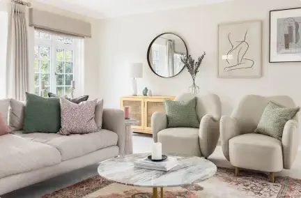
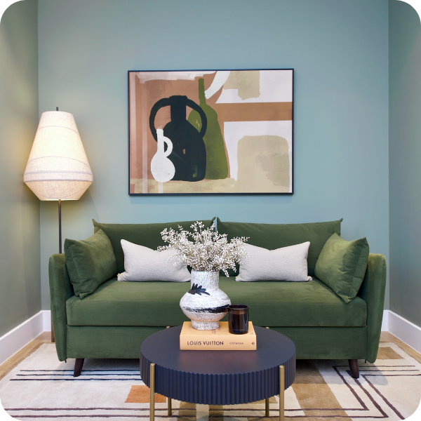
1. Biophilic design
Image Credit: My Bespoke Room

Biophilic design has been on our radar for a while, but in 2025, it’s going to feel more like a movement than a trend. At its core, it’s about creating a stronger connection to nature in our homes. Think natural materials like wood and stone, earthy colours, and, of course, plants—lots and lots of plants.
Why is it becoming so popular? Because we’re all craving a little calm in our chaotic lives, and nothing says "zen" like a home that looks and feels alive.
"Biophilic design, which emphasises a connection to nature through materials like wood, stone, and greenery, is only going to grow in popularity this year. It’s about creating calming, beautiful environments that help reduce stress and promote well-being." - Interior Designer, Nardus.
%20(6).png?width=100&height=100&name=Quote%20image%20(250%20%C3%97%20250px)%20(6).png)
Interior Designer, Milena adds, "People are looking for ways to connect with nature while adopting eco-friendly practices. Biophilic design creates harmonious and sustainable interiors that feel grounded and alive."
Ready to fall in love with your home and start living a better life? Book a room design today from just £395!

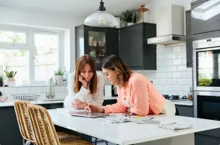
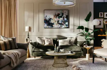
2. Maximalism and bold spaces
Image Credit: My Bespoke Room
In 2025 we will be expecting to say goodbye to minimalist spaces and hello to maximalism—where more is more, and every corner tells a story.
Maximalism isn’t about creating clutter (don’t panic); it’s about layering colours, patterns, and textures to build a home that feels joyful, expressive, and uniquely yours. This trend is a response to the overly sterile interiors we’ve been seeing for years—it’s time to have fun with your space again!
Interior Designer, Sarah explains, "It’s about layering bold colours, eclectic patterns, and meaningful items that reflect your personality. This trend lets people create rich, expressive spaces filled with character."
How to Bring It Home:
- Start with a statement piece that makes you smile, whether it’s a patterned rug, a vibrant sofa or a bold piece of art.
- Mix and match textures—it could be velvet cushions, a woven throw and a glass vase on a wooden coffee table to create a look that feels rich and dynamic.
- Showcase your personality with items that have meaning: family heirlooms, travel souvenirs or quirky finds from vintage shops.
Love these 2025 trends but not sure where to start? Book a free consultation with our interior design experts today!
3. Sustainability: Quality over quantity

Image Credit: My Bespoke Room
If there’s one buzzword that’s here to stay, it’s sustainability. In 2025, fast furniture is out, and well-made, eco-friendly pieces are in. This trend is all about making mindful choices that reduce waste and create homes that stand the test of time.
Why is it so popular? Because it’s not just about saving the planet (though that’s a biggie); it’s about creating spaces with character and heart.
In 2025, we’ll see more people investing in high-quality, sustainable options that last. It’s about making choices that are better for the planet and creating a home with character." -Interior Designer, Milena
How to Bring It Home:
- Shop vintage or secondhand for one-of-a-kind finds that are kinder to the environment (and your wallet).
- Invest in timeless, high-quality furniture that you’ll love for years to come.
- Look for brands that prioritise eco-friendly materials and production practices—your home and the planet will thank you!
Make 2025 the year you finally create your dream home.
Start with a free consultation with one of our designers to receive expert advice!
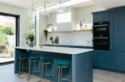
4. Colour drenching
 Image credit: My Bespoke Room
Ready to take your love of colour to the next level? Enter colour drenching—the trend that’s all about fully committing to a single hue (or closely related tones) throughout an entire room.
We’re not just talking walls here; think ceilings, doors, skirting boards, and even radiators all painted in the same rich shade. It’s a bold move, but one that creates a cohesive and immersive look that feels both modern and luxurious.
Interior Designer, Nardus explains, "Another major theme I see emerging is the use of bold, saturated colors in what I call ‘color-drenched rooms.’ This trend involves painting an entire space with a single colour or closely related tones. It creates vibrant, immersive living spaces that feel stylish and harmonious."
How to Bring It Home:
- Start with a small room like a cloakroom toilet or small guest room—choose a bold colour you love and go all-in on walls, ceilings, and trim.
- Pair it with complementary elements, like natural wood furniture or metallic accents, to add depth and texture.
- Not ready for full drenching? Try a half-drenched look by painting the lower half of the walls and trim while keeping the upper portion neutral.
Want a home that will outlive any trend? Book a room design with us from just £395 and receive a space you'll love for years to come.
Interior trends taking a decline in 2025
1. The all grey scheme
Is grey the new... passé? "The all-grey colour scheme is definitely on its way out," says Nardus. "People are moving toward warmer, earthier tones that feel more inviting and less sterile."
The colour scheme has definitely been drifting out of the spotlight for a good few years now, but is 2025 the year we really say goodbye to it?!
Even though grey was seen as the safe choice as it created a cohesive and put-together look, now it seems outdated and cold.
But don't worry if you enjoy a touch of grey! To spice up your grey interiors, try adding in some warmer shades, such as greige, introduce some natural wood furnishings and incorporate tactile and textured textiles, this way you can add warmth into the space without redecorating your whole space.
Reimagine your space with a little help from our interior designers. Book a free consultation with one of our experts to start bringing your vision to life!
2. Fast furniture

With sustainability being in for 2025, the days of disposable furniture are numbered. "Fast furniture is declining as people embrace the push for sustainability," Milena explains. "Consumers are looking for durable, eco-friendly options that last."
Want to refresh your space but don’t know where to start? Booking a free consultation with us will make it easy!
3. Minimalistic Insta worthy homes
.webp?width=600&height=899&name=0086%20(1).webp)
"Too much minimalism—those bare, all-white spaces—can feel lifeless," adds Nardus. "People want their homes to feel alive and reflect who they are. Personal touches and layered designs are taking over!"
Our expert designers are ready to create a space you love, that is also within your budget, so book a room design with us from just £395:
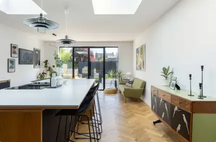
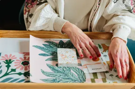
How to incorporate trends into your home

Image Credit: My Bespoke Room
Fallen in love with a trend, but concerned about seamlessly integrating it with your existing home décor? Fret not! Our designers are here with expert tips on effortlessly blending different styles, ensuring that your newfound love enhances the overall aesthetic of your space.

"Try to find an item that you already need for your home, but in a brand new style, colour or material that aligns with the trend you love" - Interior Designer, Alice

"To make your home more sustainable, look for bygone gems in charity shops or Nan and Grandad's garages and attics. Give them a new lease of life in your space" - Interior Designer, Ruchi
 "I always say if a trend suits what you love then jump on it, but ultimately your home is a reflection of you and trends will pass quickly. You can add trends in the bits that are easy to change, accessories, cushions, throws and artwork. But keep the big things like furniture and flooring in your style and in a way that you will enjoy for years to come." - Interior Designer, Laura
Your home should tell your story, not follow the crowd. Let’s design a space that’s all about you—schedule your free consultation!
-1.png?height=300&name=Untitled%20design%20(16)-1.png)
-2.png?height=300&name=Untitled%20design%20(15)-2.png)