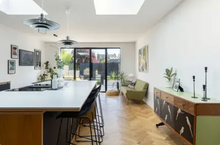
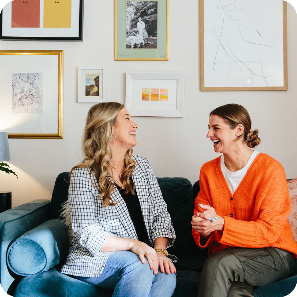
Our Head of Design, Lucy took a trip to meet Lick's Head Colour Specialist, Tash Bradley at her stunning studio flat in South London. She shared so many incredible tips we could have made a whole series dedicated just to her!
How to choose the perfect paint colour for your room
With a sea of paint colour options out there, it can seem like an impossible task to choose the perfect colour for your room.
We visited Tash Bradley, Head Colour Specialist at Lick who took us through all her top tips on choosing the perfect paint colour for your home as well as spilling the beans on her colour trend prediction for next year!
She also gave us a tour of her stunning studio flat in South London which you can watch here.
Lick Q&A:
Lucy: "How do you go about choosing the best colour for your home?"
Tash: "Something I'd really consider is the direction that the room is facing. The light will play a huge part in how that colour in the room will look.
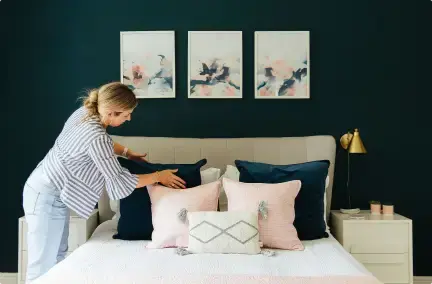
If you have a North facing room, what you probably will have noticed is that they lack that warm natural sunlight. So you want to warm them up either with a white with a yellow or a pink undertone - going for light pinks is a great option. Or, as I always say to clients - embrace the darkness and go for a darker colour. Darker colours absorb shadow. They're a great way to make a dark room feel a bit more special and dramatic.
If you have a South facing room, these rooms are light and bright and get that lovely daylight throughout the whole day. So I lean more towards keeping those room lighter but you could go for any colour you want and it would look stunning!"
.png?width=1920&name=Larger%20Post%20images%20(1).png)
"East and West - just remember that the sun is rising in the east so it's more of a whiter sun so I think that pinks look very pretty if you're looking at a bedroom. Then West, the sun is coming down and has more red tones in it so look at balancing that with a green or a blue."
Trying to perfect that three quarter painted wall? Watch as Tash shows us how:
Lucy: "How did you go about choosing the lovely colour in your home?"
Tash: "This flat is actually South facing but because it's lower ground, it does lack quite a lot of light. So I knew I wanted to go for a lighter colour.
I really connect with the emotion that pink gives you. It's that warm cuddle at the end of the day! It's bright, it's light, it's warm, it's very calming. Also it makes the best background colour to other furnishings that I have."
.png?width=1920&name=Larger%20Post%20images%20(2).png)
Lucy: "Yes, it's lovely with the teal. People automatically think when you say 'Pink' it's a candy pink but it doesn't need to be that does it?"
Tash: "Completely! We do four pinks. All of them have a black pigment added to them so they make them less sugary and sickly pink. So they're all bit more muted.
This is actually Pink 01. It's our palest pink and I think of it as a replacement of a neutral."
Watch our house tour of Tash's beautiful studio flat!
Lucy: "What colours would you recommend for a really calming master bedroom?"
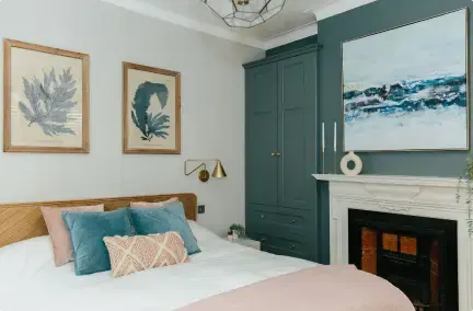
Tash: "I would really recommend that you look at your blues. Blues affect the mind so if you go for a softer blue, they're more mentally soothing.
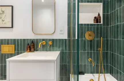
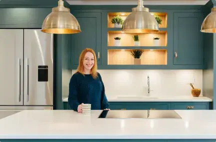
The other one I recommend a lot is green. Green is the most restful on the eye because our eyes don't have to adjust to the colour green. So going for a lovely green will help you connect with nature and feel very grounded.
.png?width=1920&name=Larger%20Post%20images%20(3).png)
Lucy: "Saying green, we're seeing so many more inspirational images from our clients loving green. It was blue a few years ago and now there's so much more green."
Tash: "Absolutely. I think because of the year we've had, people have massively lacked that outside stimulation. So people have really looked to their homes to be really grounded, very safe, but also, green can bring energy. Our biggest trend that we've seen is our green and our pinks which have become the most popular.
Lucy: "Any top tips for decorating a hallway?"
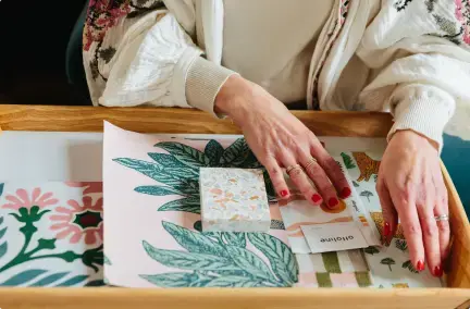
Tash: "You want to open the door and go 'wow, I'm home'. I love making a feature of these smaller rooms. So going for a wallpaper is a great option. I think it's a lovely place to use as a source of palette inspiration.
So you can pull your colours from the design and use those in other rooms to create a lovely flow. All our wallpapers have been designed to pair beautifully with our paint colours.
.png?width=1920&name=Larger%20Post%20images%20(5).png)
This one I use a lot as a palette inspiration with the pink and the green. The lighter colour you could use in kitchens and living rooms and then the darker colour could with in the bedroom or home office, that sort of thing."
Lucy: "Before I go, what is going to be THE colour of 2021/2022?"
Tash: "Green has been the go to colour for this year so keeping that theme - I'm actually mixing one at the moment which I think is going to be go to colour! It's more of a tealy green, but our current tealy greens are quite muted. I think this is going to have more of an energy to it, it's going to be brighter. You're going to be able to use on kitchen cabinets, in bedrooms, in hallways in bathrooms. So yes, I predict that will be the one!"
.png?width=1920&name=Larger%20Post%20images%20(6).png)


.png)






.png)


 Subscribe


-1.png?height=300&name=Untitled%20design%20(16)-1.png)
-2.png?height=300&name=Untitled%20design%20(15)-2.png)