It’s spooky season, and while ghosts and ghouls may haunt our dreams, nothing sends chills down our spines quite like terrifying interior design mistakes.
Our designers have faced it all—so before you end up with a home more horror show than heavenly, here are some frightening faux pas we’ve seen and how you can exorcise them for good!
Don’t let design dilemmas haunt you! Book a free call with one of our expert Interior Designers to discuss your home transformation.
1. The overstuffed tomb

Image credit: My Bespoke Room
Ever walked into a room and felt like the furniture was about to swallow you whole? That’s the ‘overstuffed tomb’—where oversized sofas, tables, or armchairs dominate the space, making it feel cramped and claustrophobic. The room may be screaming for air, but the furniture is sucking all the life out of it!
How to avoid it: Scale is everything! In tighter spaces, opt for smaller furniture with sleek profiles and taller, slimmer legs, and avoid bulky, oversized pieces that overwhelm the room. Always measure your space and choose furniture that fits proportionally—think cosy seating, not a throne fit for a vampire king.
Need help designing your small living room? Discover 16 of our expert's best ideas for decorating your small lounge.
Don’t let your home turn into a haunted house! Book a room design from just £395 and let us help you create a boo-tiful space!
2. Phantom lighting

Image credit: My Bespoke Room
What’s scarier than a horror movie with bad lighting? A living room that feels like you’re walking through the dark woods! Dim lighting or relying solely on overhead light is a major design sin that can leave your home looking flat and gloomy.
To avoid dim lighting, go for layers. Use a mix of overhead lights, floor lamps, and accent lighting like candles or fairy lights to brighten things up. Not only will your space feel bigger and brighter, but it’ll also add warmth and depth—so you won’t be left hiding from the shadows.
Curious about what other design mistakes we see on the daily? Check out our blog on the biggest interior design mistakes (and how to avoid them!)
Feeling spooked by design decisions? Then book a free, no-obligation chat and let’s conjure up your dream space!
3. Monster sized rugs
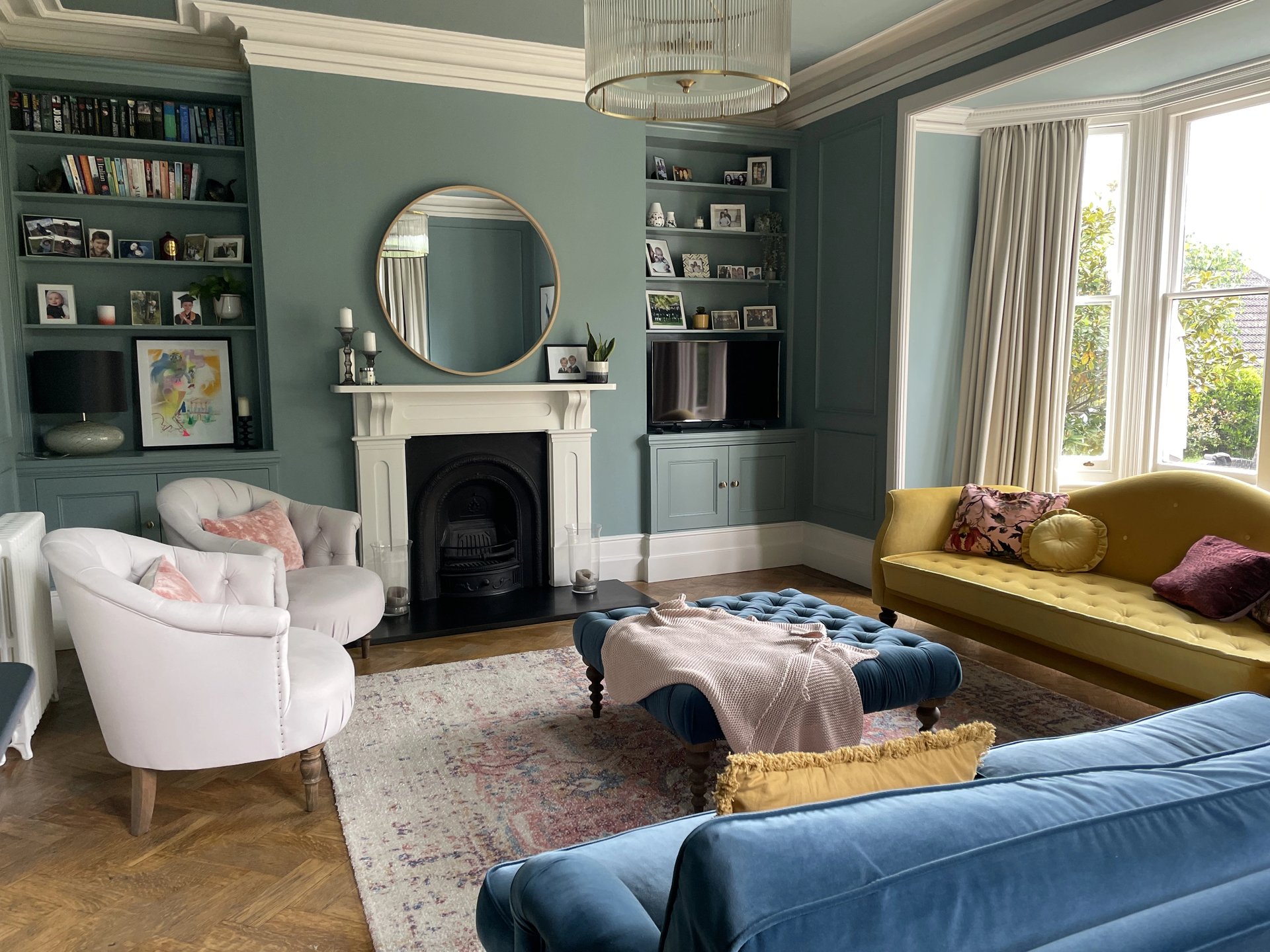
Image credit: My Bespoke Room
When it comes to rugs, size really does matter! A monster-sized rug that swallows up your space can feel overwhelming, while a tiny, “floating” rug leaves your room looking disjointed and unfinished. Getting the rug size wrong is a beast of a mistake that can throw off the whole room’s balance.
As a rule of thumb, the front of your furniture should at least partially sit on the rug to anchor the space. Avoid rugs that are too small or too large for your room—your rug should complement the furniture, not overpower or underwhelm it!
Looking to discuss your home project? Book a free call with one of our professional Interior Designers to find out how we can help:
4. Cursed colour choices

Image credit: My Bespoke Room
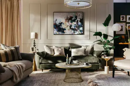
Some homes are haunted by the fear of colour—leaving every wall, sofa, and accessory in monochrome (and not in the chic way). While neutral tones have their place, too much beige or grey can leave your home feeling flat and lifeless.
Break free from the colour curse and add bold pops of colour through throw pillows, art, or accent walls. Just make sure your palette flows with shades from the same colour family, with similar undertones and try to avoid clashing colours that’ll give you (and your guests) sleepless nights.
Need help picking the perfect shade for your home? Click here to read our expert paint colour guide!
Want to know the magic behind our design process? Click below to see how we turn frightful into delightful!
5. Furniture graveyard
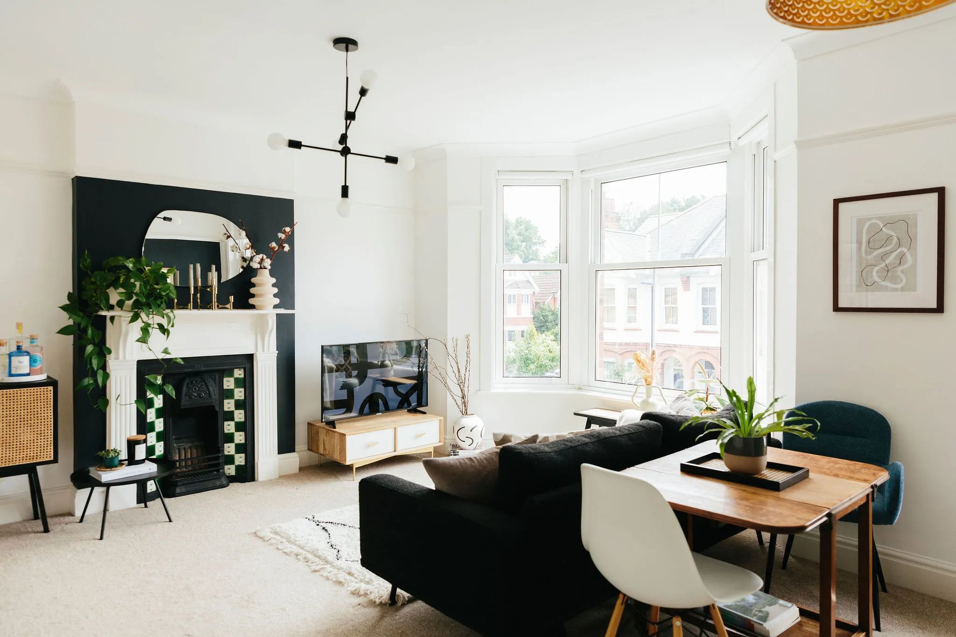
Image credit: My Bespoke Room
We get it—pushing all the furniture against the wall feels like a quick fix to create more space. But guess what? It’s a one-way ticket to a ghost town layout, where everything feels disconnected and… well, a bit dead.
Instead, float your furniture! Creating cosy, intentional zones by pulling pieces away from the wall can transform your space. A centred seating arrangement around a coffee table encourages conversation (and discourages creepy dead space in the middle of the room).
Don't have much space? Don't threat! You only need to move those pieces an inch or so from the wall to make your room feel so much more light and airy.
Discover the best way to layout your living room with our Interior Designer's layout ideas.
Wave goodbye to your design nightmares! Book a room design with us from just £395 and watch your home transform from ghastly to gorgeous!
6. The haunted hallway
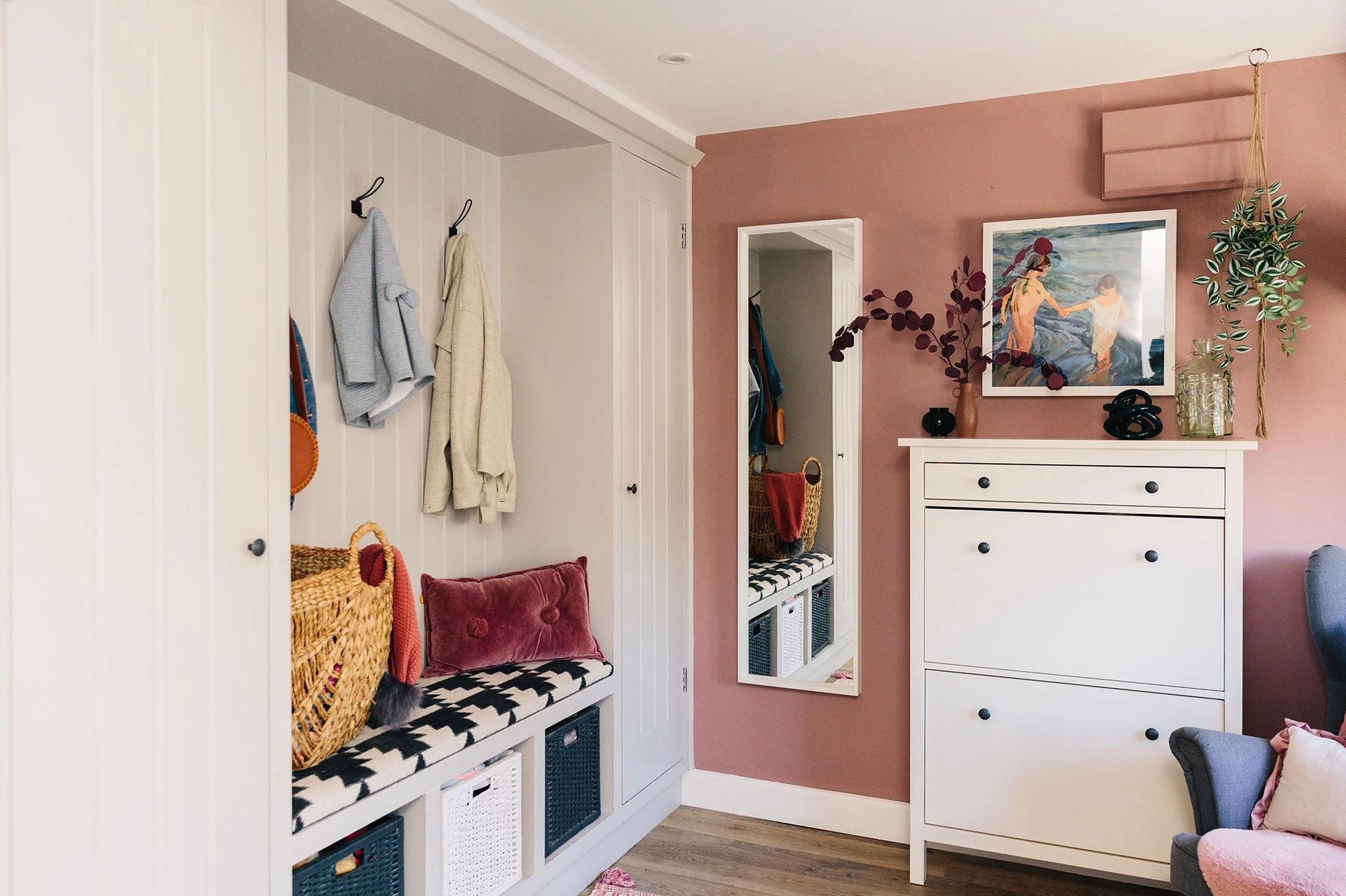
Image credit: My Bespoke Room
Hallways and entryways are often the forgotten corners of a home, left as bleak, empty passages where nothing happens. A haunted hallway is no way to welcome guests or even yourself!
Try to treat small spaces like a design opportunity! Add a stylish console table, an inviting rug, or a well-placed mirror. These simple additions will breathe life into these areas and make sure no space feels neglected.
Give your hallway the wow-factor with our complete hallway styling guide.
Your dream home doesn’t have to be a ghost story! Book a free call with our fab Interior Designers to avoid any spooky design mistakes:
7. Zombie trends

Image credit: My Bespoke Room
Beware the zombie trend! Remember when all grey interiors or rose gold hardware overload was in? It might look alive now, but in a few years it will be a distant (and maybe even cringeworthy) memory. Trends come and go, but your home is forever.
Stick to classic, timeless pieces as the foundation of your space. There's no harm in loving trends, so if you see a style you love, try incorporating it in small ways with pieces like throw pillows, accessories, or artwork so it’s easy to switch out if it ever starts to feel more spooky than stylish!


.png)







 Subscribe


-1.png?height=300&name=Untitled%20design%20(16)-1.png)
-2.png?height=300&name=Untitled%20design%20(15)-2.png)