At My Bespoke Room, we have designed 1,000s of rooms up and down the UK, and throughout that time we have gathered some great before and after pics that are so satisfying to see!
Now, we know how much everyone loves a home transformation, and so we have gathered our most loved before and afters, just for you lucky readers! There is truly no better place to see our interior designers work their magic.
So, sit back and get ready to be wowed by our favourite rooms, transformed beyond recognition.
Get your own unforgettable before & afters by booking a room design today for just £395!
10. A warm and cosy green Victorian snug
Image credit: My Bespoke Room
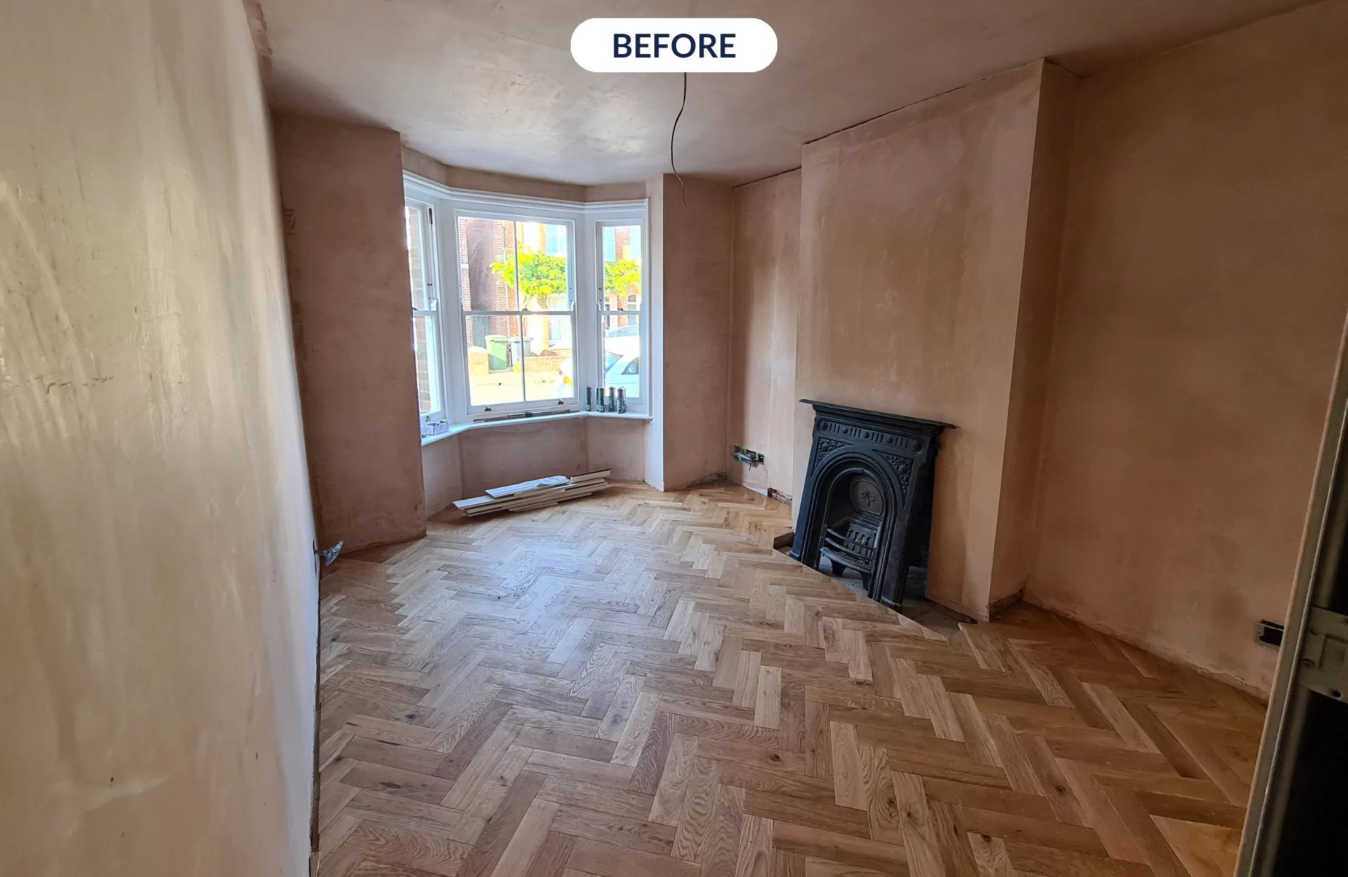
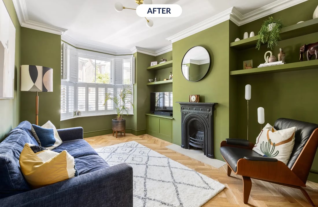
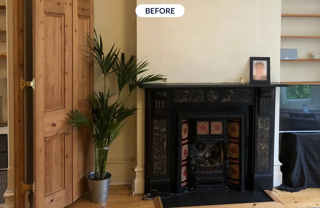
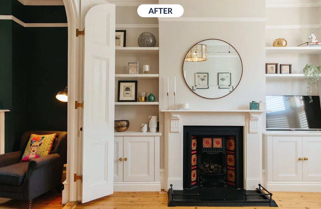
Number 10 on our list of top room makeovers is this bold living room which was part of a whole-home transformation. This north-facing lounge had both the struggles of being rather small and also dark, so we decided to embrace the cosiness by going for a deep green shade.
To make the space feel less cramped, the designer on this project went for a fitted cabinet for added storage and also to hide messy TV cables. Plus, the mirror above the fireplace was a perfect way to bounce light around the living room and make the whole space feel brighter.
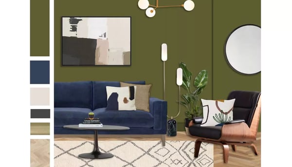
The abstract patterns features within the artwork, pillows and rug tie this room together effortlessly and develop a completely cohesive look.
Our absolute favourite thing about this living room before and after is how the space just magically looks bigger due to a few handy paint tricks. By painting the skirting boards the same colour as the walls, the walls feel a lot taller, and by using the same trick with the shelves and storage unit, they are made to look almost invisible!
See the design here...
9. Mid-century inspired home office
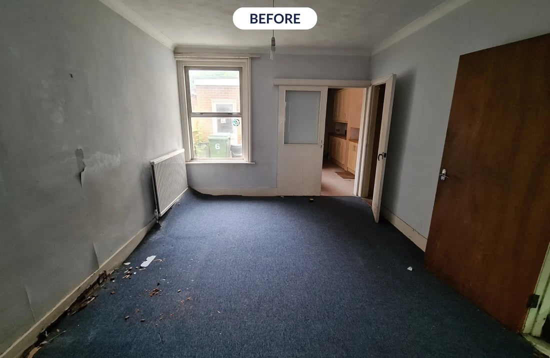
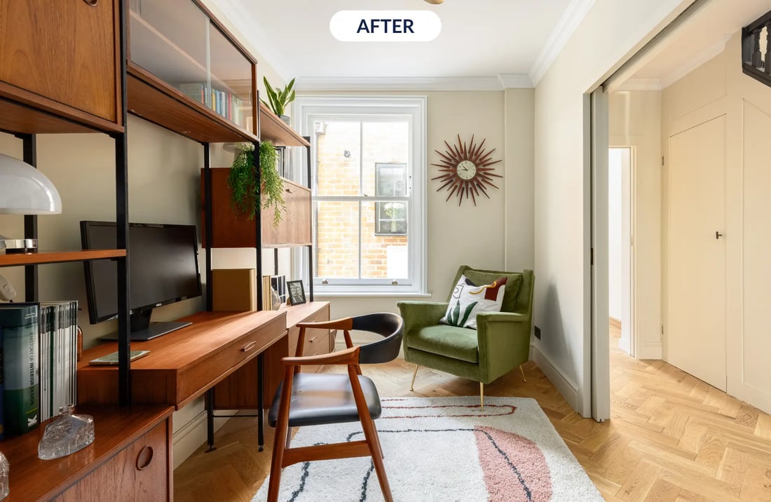
Image credit: My Bespoke Room
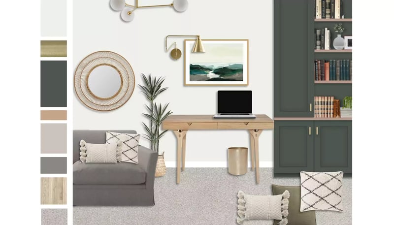
Number 9 truly takes the concept of an "unrecognisable room transformation" to a whole new level. Whether it's the office-like carpet or the flaky paint in the before photos, the after pictures undoubtedly showcase that sometimes you just have to sense the potential in a room and trust the process!
By cleverly painting this office the same shade as the hallway, the two rooms blend effortlessly into one making the space feel larger and more open. However, by incorporating a rug in the centre of the room, the office is also zoned off, giving the room clear definition.
Looking to discuss your home project? Book a FREE call with one of our experts today:
8. Bright and glamourous home office
Image credit: My Bespoke Room
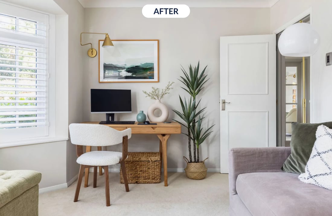
This bright home office a totally inspiring space that can also be used as an area to sit back with a book and relax. The strategic placement of the desk beside the window means that the natural light is maximised for optimum motivation.
By using layered lighting (with the incorporation of ceiling fixtures, wall and floor lamps) the space can adapt throughout the day, meaning that both task and ambient lighting can be achieved to perfectly suit the mood.
Though the wall shade was kept neutral, colour is incorporated through the soft furnishings, artwork, ornaments and house plants. This stunning home office simply feels like a breath of fresh air and I'm sure we're all a little jealous we don't have one in our own home!
See the design here...
7. A cosy, blue living room with fireplace alcoves

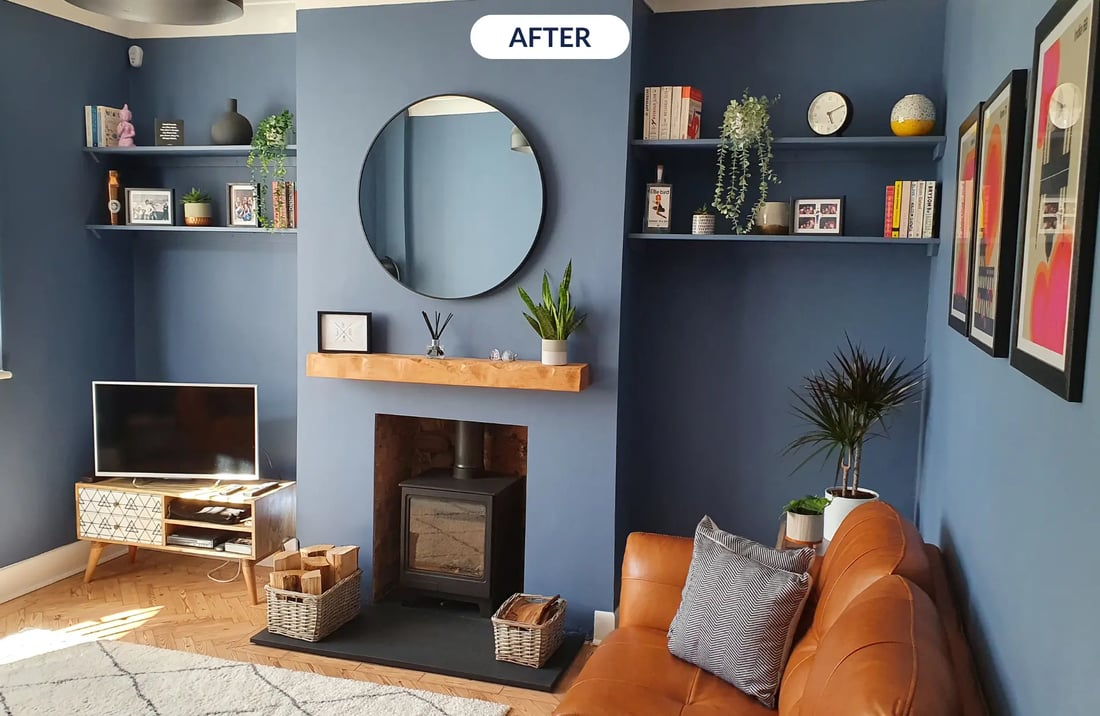
Image credit: My Bespoke Room.
Another living room that needed a lot of vision (and a little bit of hope) was our number 7 spot. The homeowners for this project could see the beauty beyond the chaos and came to us looking for help.
Collaborating with their designer, the lounge was completely transformed into a relaxing living room with a lot of character. By implementing vibrant colours with artwork, house plants and ornaments, this room feels super fun while remaining clutter-free and visually pleasing.
Overall, the clean and crisp lines combined with some beautiful styling have made this room unrecognisable from its before and we are sure any guests who enters the space are bound to be wowed!
Click the button below to shed some light on our room design prices!
6. A formal, white lounge with elegant gold touches
Image credit: My Bespoke Room.
Our followers really do love Victorian home before and afters! In the number 6 spot is this sophisticated living room which is situated in a stunning period property.
This lounge is the total definition of 'calm' with the clean, fresh walls that are complimented by plenty of layered, cosy textures through the throws, cushions and rugs.
The interior designer on this project modernised the living room by reducing the wooden elements and just letting the floor do the talking. Plus, by refreshing the walls, doors and shelving with a fresh, white hue the whole space is made to look larger, more cohesive and totally incredible.
Here's how our designers planned to bring the space to life...
Ready to transform your home beyond recognition? Book your room design today for just £395:
5. Terrazzo tiled bathroom with blue accent wall

Image credit: My Bespoke Room & Da Silva Design
This bathroom that takes our number 5 spot truly underwent a total transformation - so much so that even we struggle to recognise it!
A lot of room was gained by rotating the bath along the back wall, making way for extra floor space. Plus, by using the same terrazzo tiles on the bath and the wall behind, the eye is tricked into thinking the bathroom is bigger than it is.
This before and after is so well loved, as it looks like any old bathroom that we could all have in our own homes, with the same boring tiles that have been there since the home was built. But, our talented designer Celine, completely revived the space with modern and bright tiling, adding texture and more interest to the space.
The addition of recessed shelving allows for tidy storage and the house plants are a fun way to add a pop of colour, all while clarifying the air.
4. Victorian hallway with classic, brass features
Image credit: My Bespoke Room.
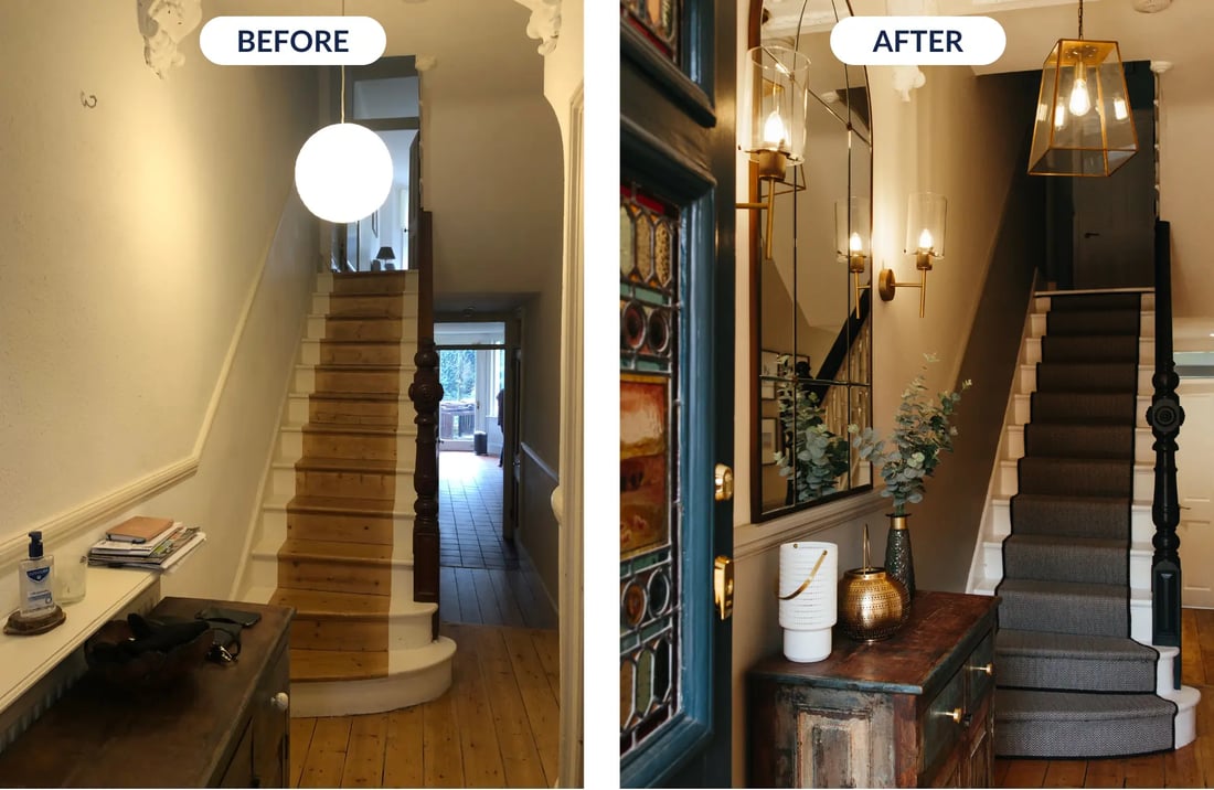
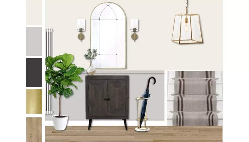
A lick of paint can really make a world of difference and it's proven here in this warm hallway; the half-painted grey wall amazingly exaggerates the dado rail, plus, by painting the balustrade black, it stands out, becoming a beautiful focal point.
If you're a lucky owner of a stunning period property, using paint is one of the best ways to breathe new life into the original features and make them noticeable.
The rest of the colour palette was kept fresh and light to really give the period features a chance to shine.
A stunning, large mirror also made a real impact. By placing mirrors in small or narrow spaces, the room is made to feel much bigger as light is bounced around the space.
Checkout the design for this stunning hallway...
Curious about how you could achieve incredible before & afters in your own home? Discuss your project with one of our experts to find out how!
3. A calming soft pink and blue bedroom 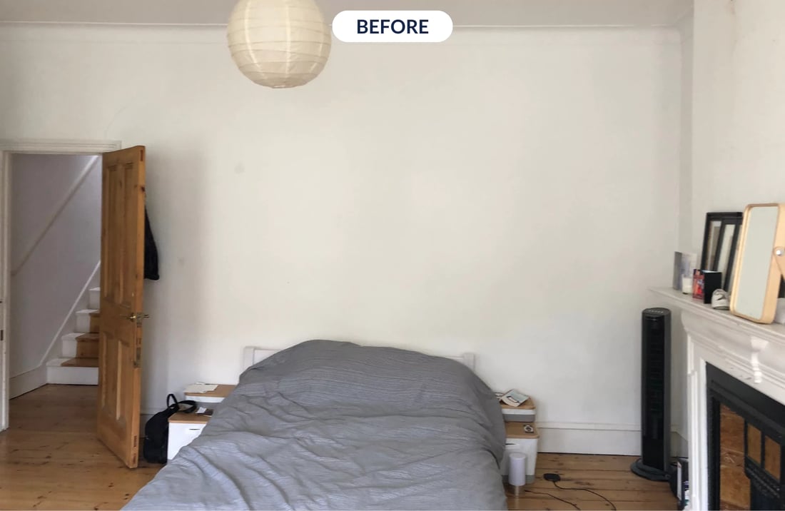
Image credit: My Bespoke Room
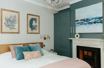
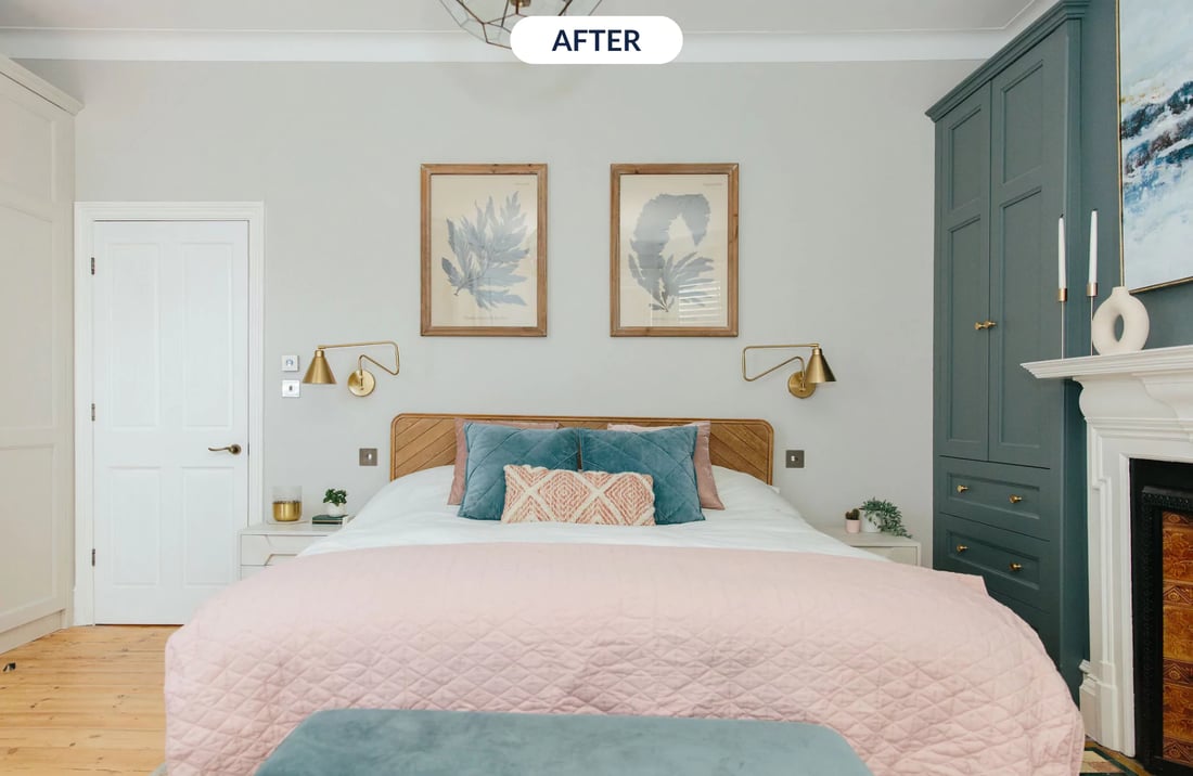
It's no wonder this bedroom has made it into the top 3 of our list of favourite room makeovers, as the previously dull, white room has been totally transformed into a relaxing retreat.
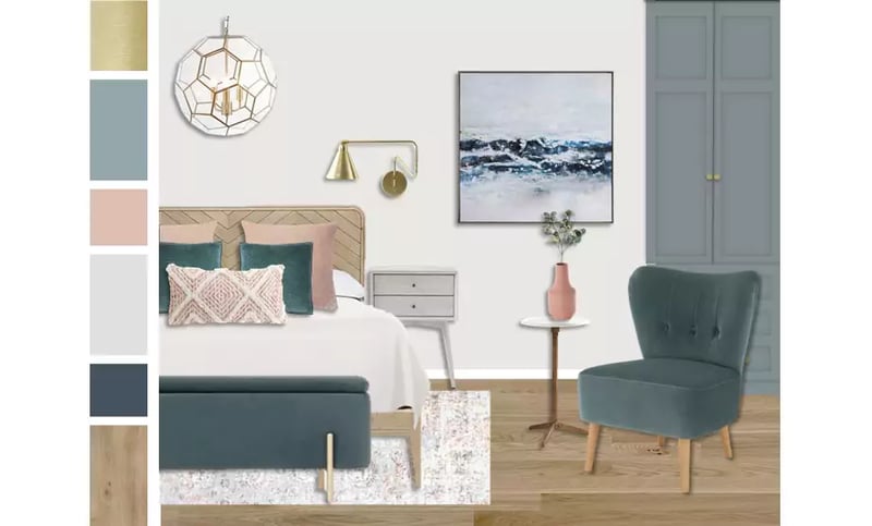
There are so many beautiful elements in this design, from the blue artwork which is perfectly paired with the wardrobes, pillows and ottoman to the soft pink hues that just ooze comfort.
But, the star of the show in this home before and after is the amount of storage that simply blends into the space. Sometimes storage can be an eyesore, but the designer on this project cleverly chose to paint the wardrobes the same colour as the back wall to make them almost invisible.
The elegant gold lamps pair perfectly with the wardrobe handles to contribute further to the sophisticated look of the room, and by attaching them to the wall, space was saved on the bedside tables, making the tables look clutter-free.
Here's how we created the moodboard to bring this bedroom to life...
Think hiring an interior designer is expensive? Think again. Transform your space for just £395 now:
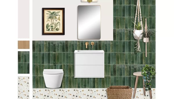
2. Stylish, green tiled bathroom with gold finishes
Image credit: My Bespoke Room
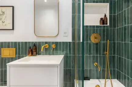
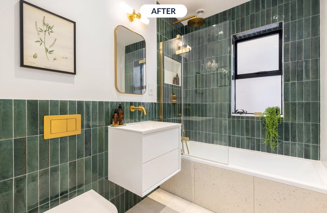
Just missing the top spot, is this wow-worthy bathroom that feels like stepping into a spa.
From dingy to dazzling, this bathroom has experienced an unbelievable makeover from the My Bespoke Room team, you wouldn't of even believed they were the same room!
Green is totally the new black and our clients are requesting it more and more for their own homes. The subway tiles were stacked horizontally to create a more modern look and they just sit beautifully against the gold hardware.
With the addition of the light and subtle terrazzo tiles on the floor and the side of the bath, the space is made to feel so much brighter than the before.
See the stunning design below...
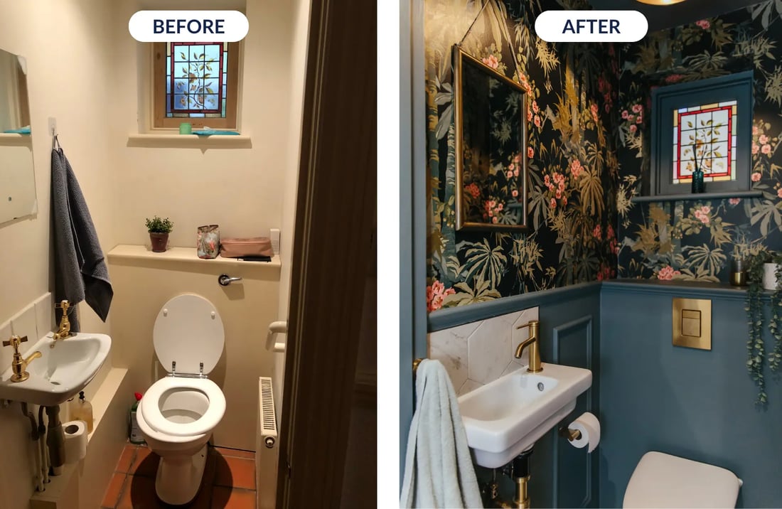
1. Bold blue and tropical cloakroom bathroom
Image credit: My Bespoke Room
Finally, in number 1 spot of our favourite home transformations is this cloakroom of absolute dreams. Nicknamed by the family as 'The Jungle', it truly is a fun and creative space.
As interior designers, we believe there is nothing better than going BIG in small spaces. Cloakrooms are such a great opportunity to push clients to try something new and experiment with colours and patterns.
It can be tempting to paint a small space like this a bright white shade, but trust us when we say that it won't do the room any favours!
Going for a bolder colour choice or an exciting wallpaper makes a room so much more memorable, and we're 100% sure that it's the talking point of the house.
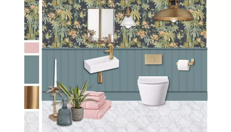
We love this home before and after so much because it's such a dramatic (but well needed) style change. The bold blue half-wall pairs so perfectly with the blue tones in the wallpaper and the gold hardware just pulls the entire room together. We won't be forgetting this bathroom design any time soon!
Check out how our designers envisioned the space...


.png)





 Subscribe






-1.png?height=300&name=Untitled%20design%20(16)-1.png)
-2.png?height=300&name=Untitled%20design%20(15)-2.png)