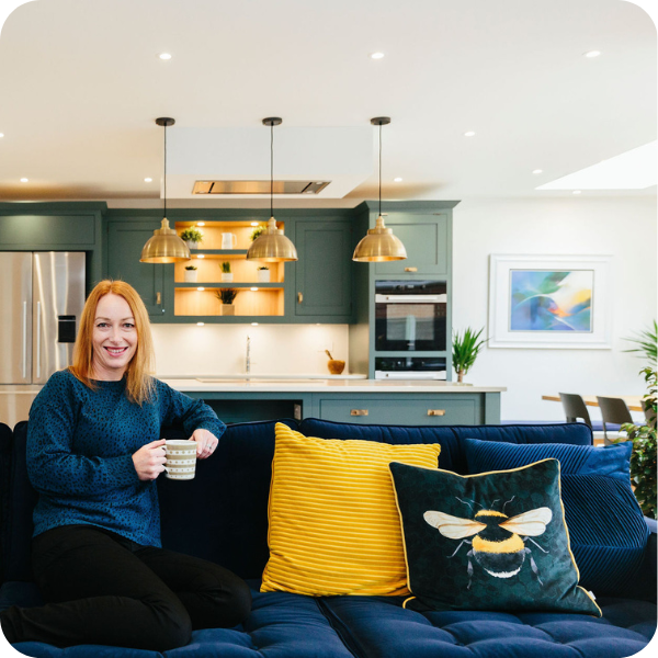
We're thrilled to give you a tour of Louise's sleek family kitchen-diner. Louise recruited us to help with a new extension at the back of their home in sunny Bournemouth. She wanted a space that would bring the family together and that was functional for a family of four without compromising on style.
Inspired to take on your own home transformation? Get started by filling out our design brief today:
.webp?width=1920&height=1250&name=Split%20landscape%20image%20(77).webp)
Image Credit: My Bespoke Room. Shop this look here and here.
Watch Louise's transformation story here:
Converting sceptics to converts
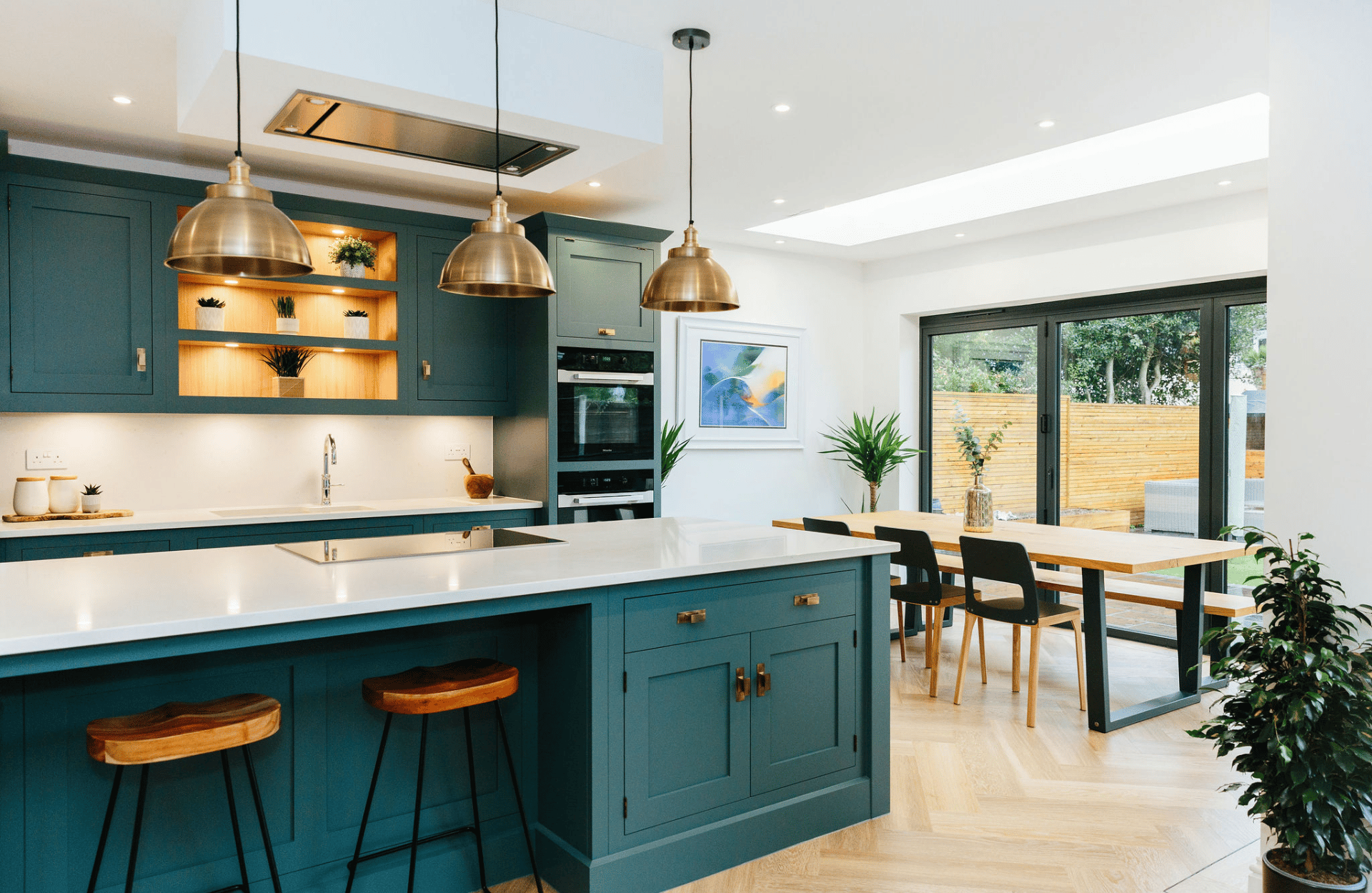
Image Credit: My Bespoke Room. Shop this look here.
Louise's husband was sceptical at first, as he was unsure how much value their designer Milena could add to their new extension. After their meeting, he was a self-proclaimed convert! Milena won him over by pointing out that their architect's plans for their beautiful new extension and the dining table size the couple had planned didn't quite match! She suggested increasing the extension at the dining room side by an extra meter to give them the space they wanted. This small shift at the planning stage was a real game changer and it's hard to imagine how the space could have worked for family life without it.
.webp?width=1920&height=1250&name=Split%20landscape%20image%20(74).webp)
Image Credit: My Bespoke Room. Shop this look here.
Does your home need a designer's touch? Book a free, no-obligation call with our team to see how we could help:
Then and now - how the new space was created
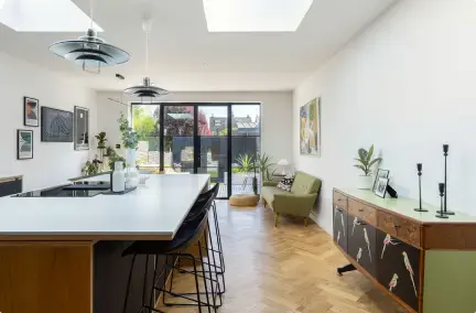
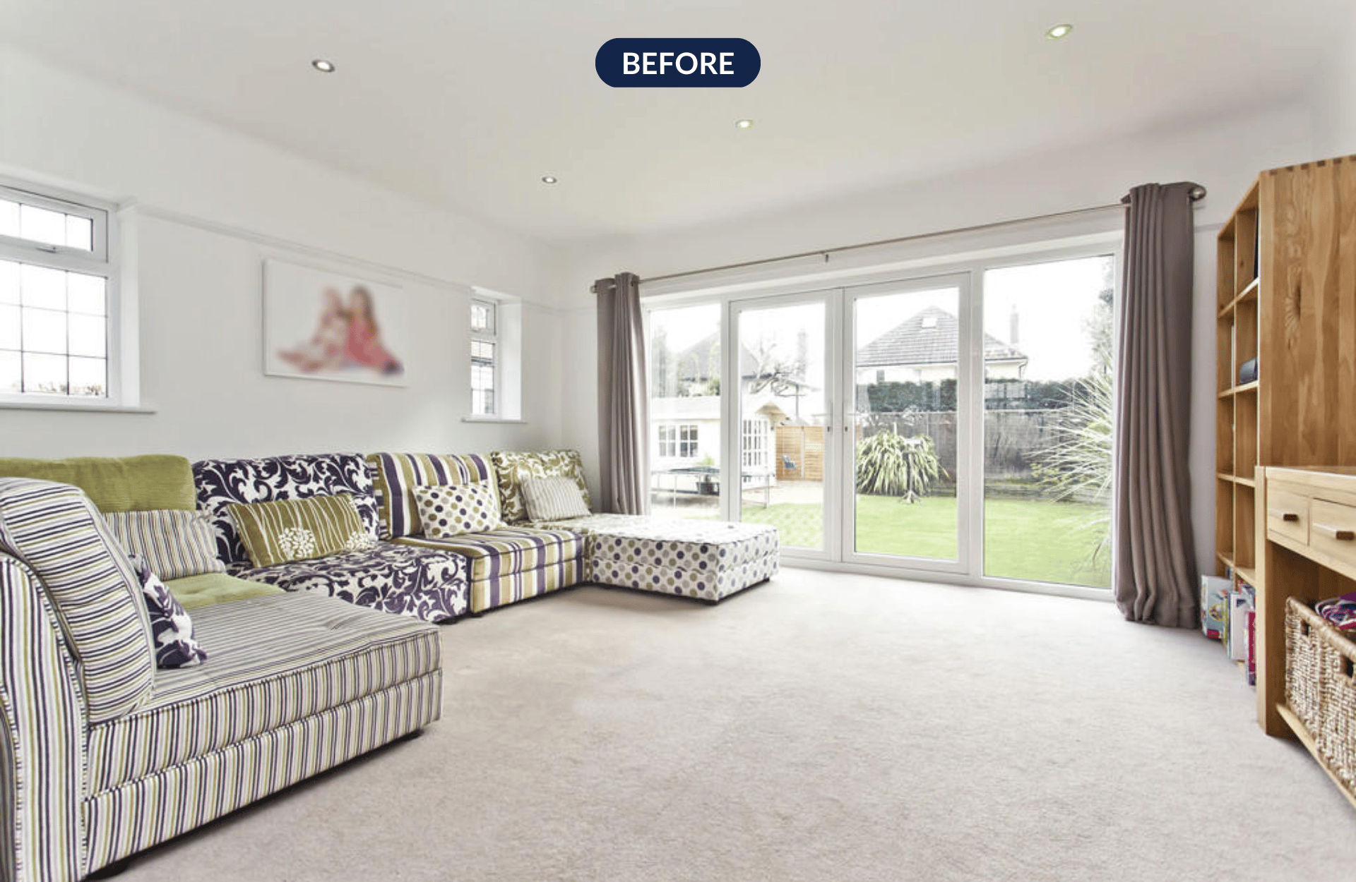
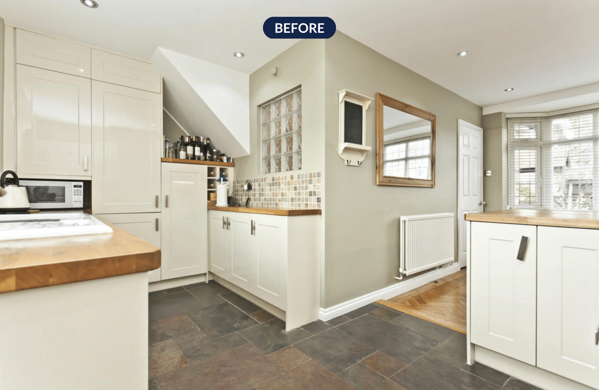
The talented team at DOT architecture had planned a beautiful side extension along the back of the house which you can see to the left of the room below. This wall with the sofa along it was then removed to create this open plan space, the width of their home with views into the garden. The dated white PVC doors were updated to sleek, modern aluminium providing stunning views from the living room.
Image Credit: My Bespoke Room. Shop this look here
The old kitchen then became the hallway, allowing dedicated space for coat and shoe storage and even a cosy seating nook underneath the stairs. With the dining room now positioned at the back of the house overlooking the garden, the old one at the front of the house could be blocked up and turned into Louise's study to work from home.
Image Credit: My Bespoke Room. Shop this look here
Inspired by Louise's home transformation? Book a free call with one of our experts to discuss your design ideas:
A designer's eye to bring it all together
With the bones of the room agreed upon and planned, it was Milena's time to shine. Open-plan spaces can be tricky to get right. All that lovely open space can become intimidating to fill and tie together but not when you have a designer on hand to help!
One of the first stages of the design process with My Bespoke Room is to agree on a design direction. In this case, Louise and her husband were drawn to bright pops of colour and wanted a perfect space for family fun but also super stylish.
Milena proposed a colour palette of blue and yellow which is a really striking and bold contrast. The use of primary colours really helps to bring energy and life to a space.
.webp?width=1920&height=1250&name=Split%20landscape%20image%20(75).webp)
Image Credit: My Bespoke Room. Shop this look here
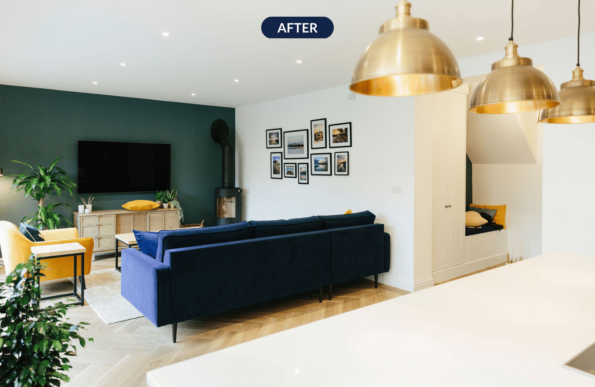
The blue feature wall in the living room serves a number of purposes and is a failsafe trick in a designer's handbook. First and foremost it provides a link with the kitchen on the other side of the room, creating cohesion and flow between the two designated spaces. It also helps to minimise the impact of the large TV.
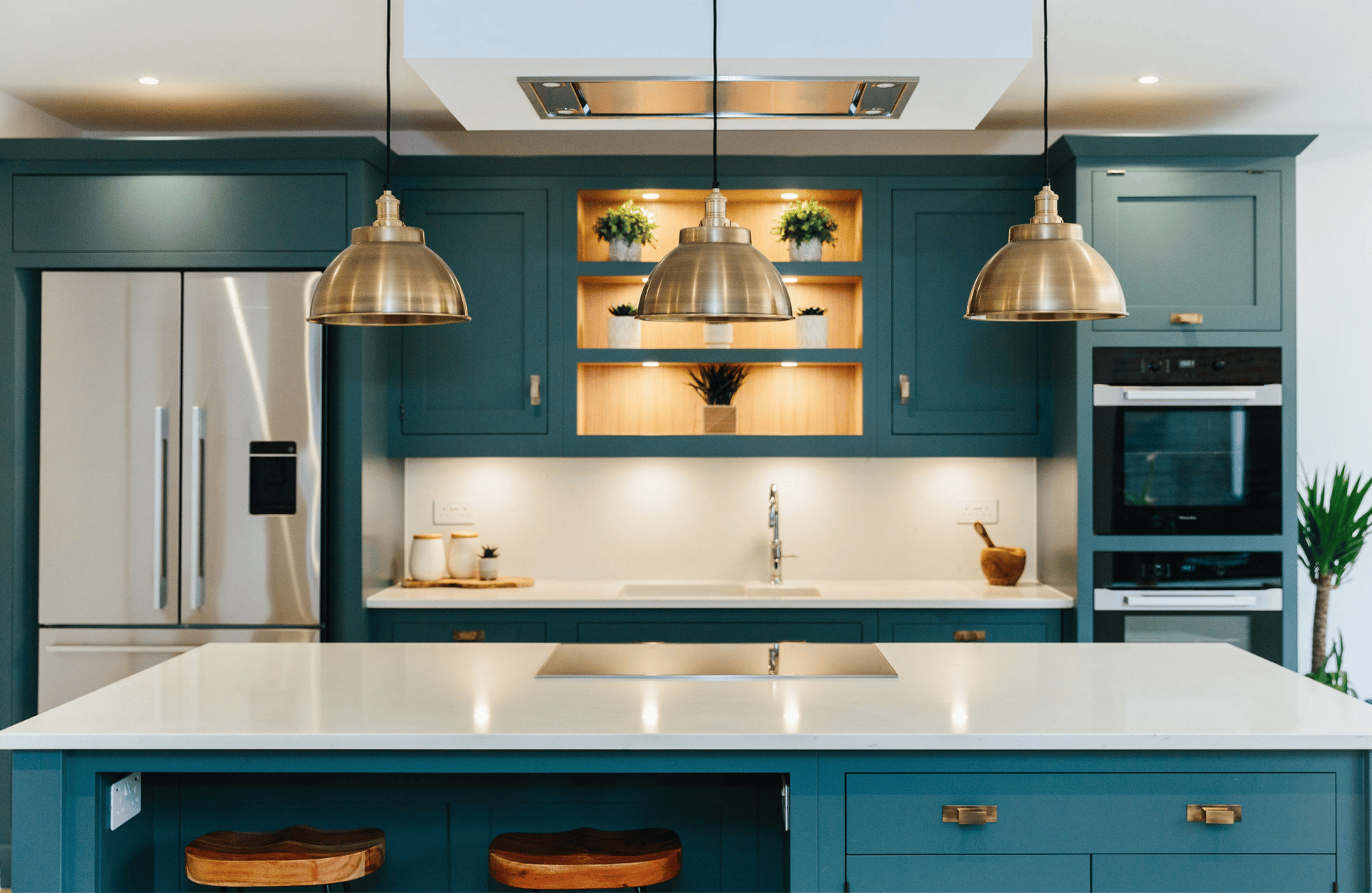
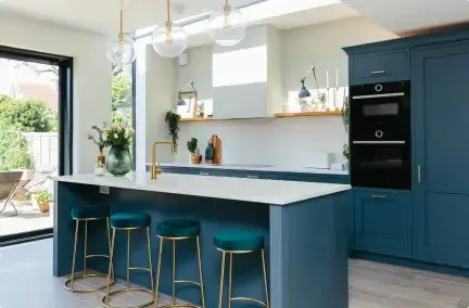
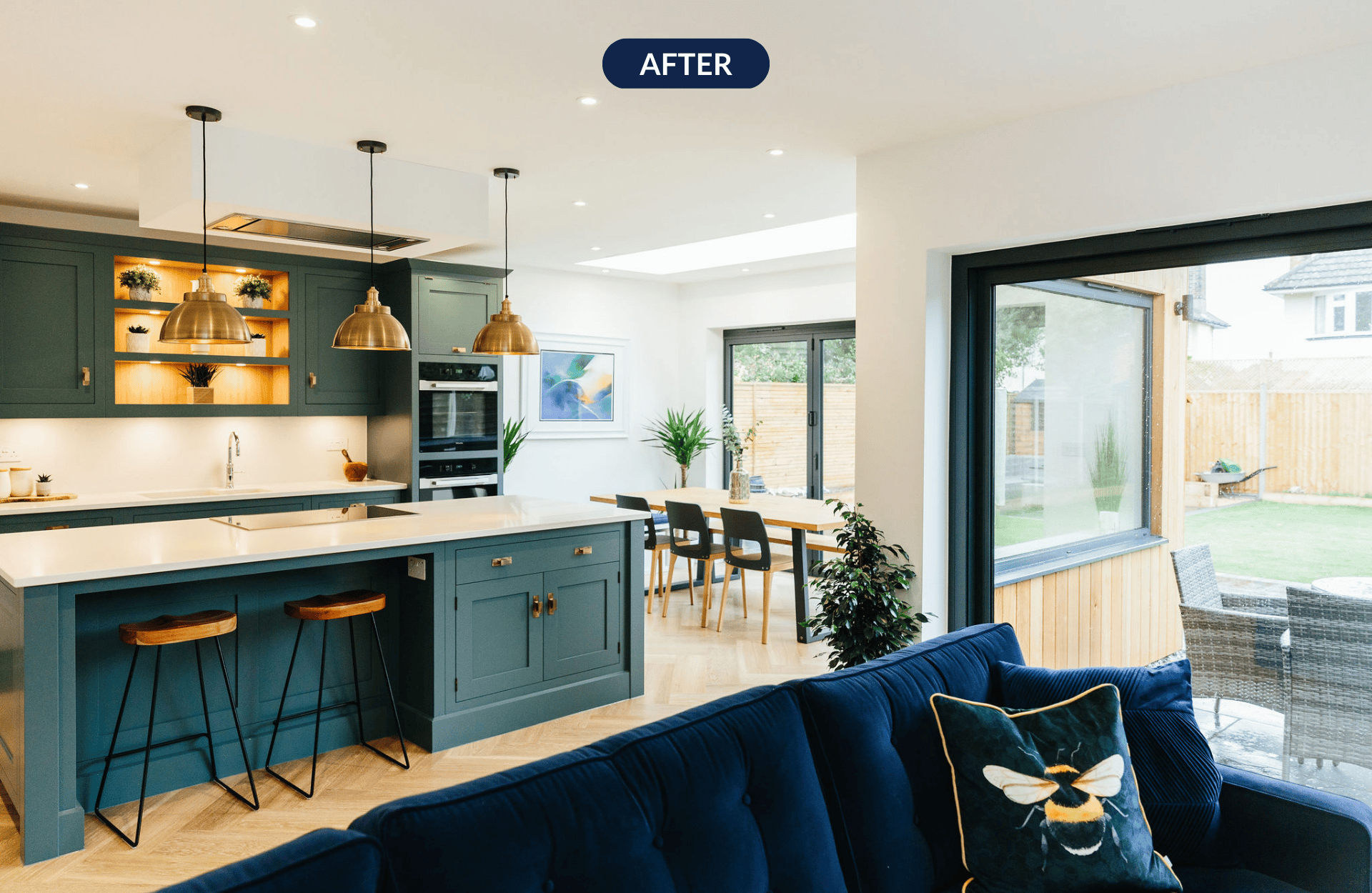
Over in the kitchen diner, this show-stopper of a kitchen laughs in the face of a simple neutral scheme! This kitchen was made by the Tom Howley who crafts beautiful and functional kitchens bespoke to the client's needs.
We absolutely love the brave, bold colour Louise and her husband chose. Often we find that having a professional designer in their corner gives clients the confidence they need to ignore the safe option and go for colours that truly bring them joy.
The shaker-style units with traditional trim give the kitchen a classic feel. The combination of implementing more modern units with this colour would have been too much of extreme and jarred with the style of the rest of the home, while this result feels cohesive and is stunning to look at. The gold hardware and pendant lights also add a touch of warmth and balance alongside the wooden elements.
.webp?width=1920&height=1250&name=Split%20landscape%20image%20(76).webp) Image Credit: My Bespoke Room. Shop this look.
Image Credit: My Bespoke Room. Shop this look.
Does your extension need a designer's touch? Book a free, no-obligation call with our team to see how we could help:
Getting personal
Image Credit: My Bespoke Room.
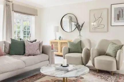
In her design, Milena suggested a gallery wall in the living room with black frames to tie in with the other black elements in the room like the floor lamp and side table legs. Louise took this one step further and filled the galley wall with their own photos from their family holidays. It's touches like this that help to create a truly unique and personal space that tells the story of its owners.
Meet Milena
-png.png?width=1920&name=Split%20landscape%20image%20(44)-png.png) Image Credit: My Bespoke Room
Image Credit: My Bespoke Room
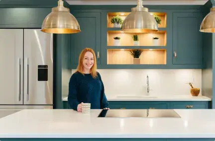
Meet our marvellous Milena, designer extraordinaire!
She was born in Rome and moved to the UK to pursue a career in financial services. However, she soon realised her forever passion was Interior Design so she re-trained, graduated and set up her own business specialising in end-to-end residential refurbishments from concept to installation. We're now exceptionally proud to have her in the My Bespoke Room team as she's created some seriously stunning designs for our customers.
Milena thrives on designing practical and functional spaces that have an added touch of something exciting, special and personal to make her client’s home a joy to live in and can be enjoyed for years to come.
"I’ve been working with MBR for three years now and I love how the company is a breath of fresh air in the industry and at the forefront of e-Design, offering our clients a very slick end-to-end process from design to purchasing of all the items. There is also a great sense of community within the super talented designers, which is quite rare in our field."
You can find out how we match you with our incredible designers here!
Would you like an expert eye on your home? Start your design brief today and then we'll match you with the perfect designer for you and your home:


.png)





.png)


 Subscribe

-1.png?height=300&name=Untitled%20design%20(16)-1.png)
-2.png?height=300&name=Untitled%20design%20(15)-2.png)