Time and time again we have customers come to us saying: 'so we did a thing, well, we don't really like it.' Or: 'we thought it would work better than it did and we don't know where to go from here.' Or just simply: 'HELP! We've made a massive mistake.'
We'd like to stop expensive mistakes before they happen, so we've created a blog post on the most common design 'faux pas' that we see. Hopefully, this will make design 'no no's a thing of the past.
So, here goes, let's take a stand to design crimes and major design disasters right now...
If you need help avoiding expensive mistakes and creating a home you love, book a free, no obligation call with on of our Interior Designers to discuss your project:
1. Not having a clear vision
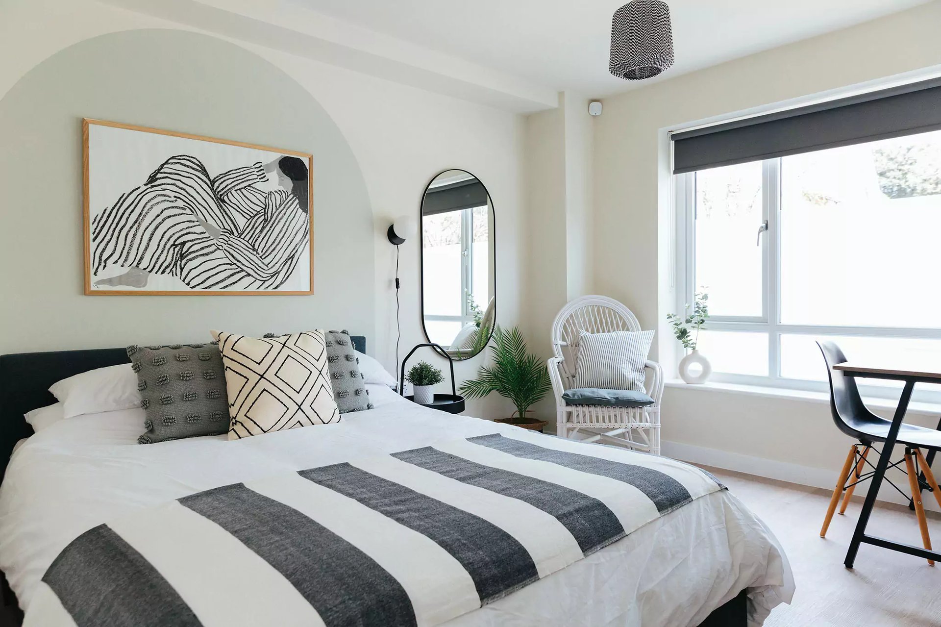
Image credit: My Bespoke Room
This common mistake is often committed by people rushing into a room transformation and purchasing items for the room without a clear vision of the end result.
We see people design their spaces from details upwards rather than the other way around but we always suggest having a very holistic approach to the interior room design to avoid the final results looking incohesive.
Interior decorating advice: Moodboards are a wonderful way of creating a design scheme for a room. An Interior Designer can create either a physical or a digital mood board (like the ones we provide our clients) which provides a guide for the colours, materials and style of the room you should follow. Anything you purchase needs to incorporate an element from the mood board.
2. Getting the scale wrong
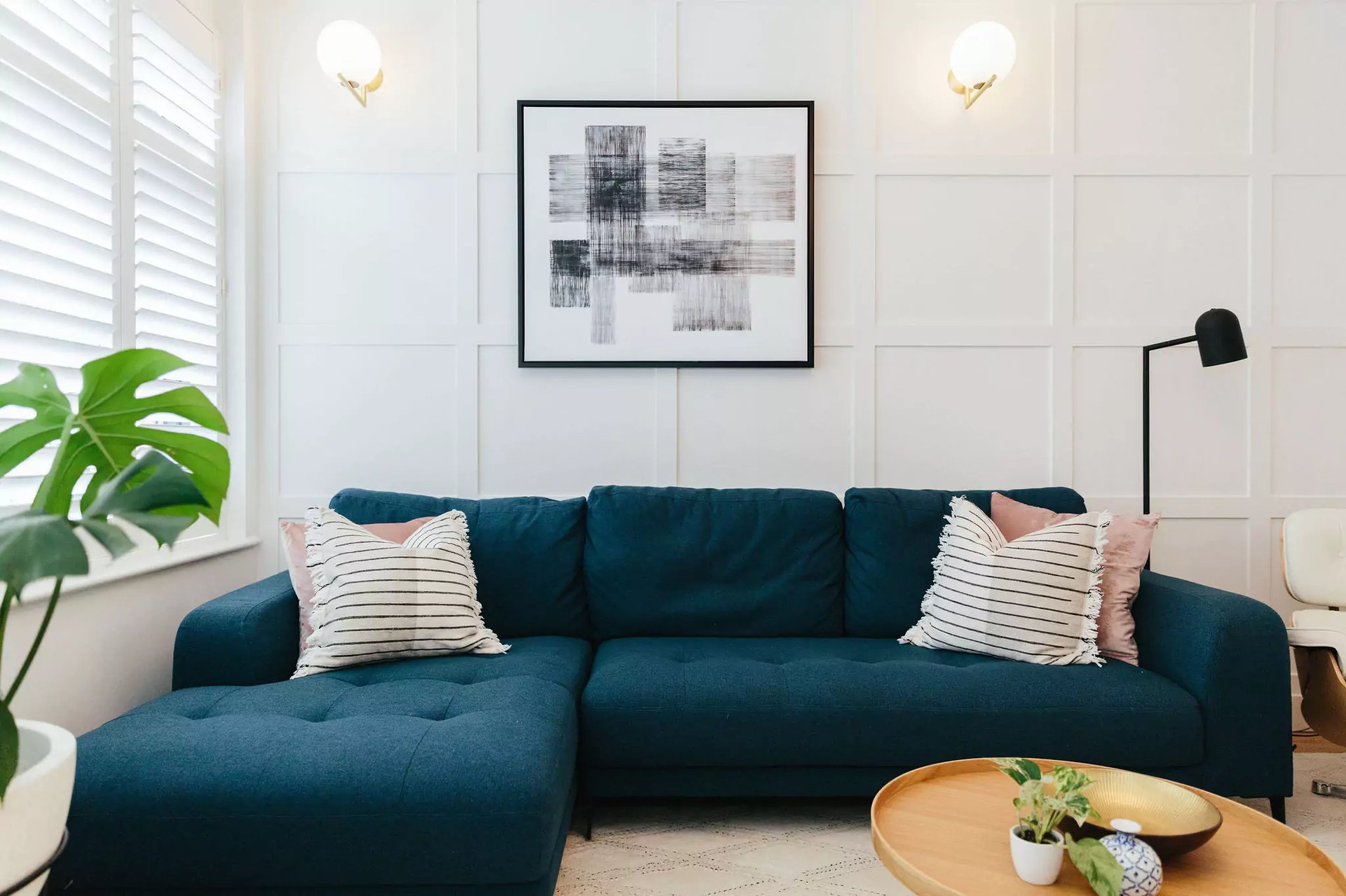
Image credit: My Bespoke Room
Unfortunately, we do often see bad examples of scale in interior design and it's so important - as it's more than just measuring to check if items will fit, it's understanding how all the furniture and accessories look together.
That's right, it turns out size does matter. A massive chair next to a little desk, a tiny frame on a large expansive wall, huge bedside tables next to a small double bed or a ginormous laundry basket in the corner of a compact bathroom will all throw off the overall look of the interior room design.
There is no set rule for deciding the scale of the items you're populating a room with, it's just something that's decided by eye. Don't get us wrong, there are standard heights for furniture such as bar stools, kitchen stools and dining chairs, but these are mostly for practicality.
When it comes to choosing furniture designs for your home interior and finishing touches that look great together, try and avoid extremes. I.e. a solo mini succulent on a huge shelf is going to look a bit lost, just like a super-king sized bed that takes up the entirety of the spare bedroom might look squeezed in.
Want to take the stress away from designing your home? Book a room design from just £395:
3. Trying to mix too many different styles
.webp?width=1920&height=1281&name=iStock-1377447141%20(2).webp)
It can get so overwhelming when designing a room as there are so many styles out there to be inspired by but this can lead to the end result looking like a hot mess!
Rosie: "One of the biggest interior design mistakes that clients often come to us with is having too many styles."
Milena: "One trick that I sometimes use to mix different styles together is the 70/30 rule. I use about 70% of the space in one style and then I add the 30% of a different style. For example, you could spice up a very traditional space with a few contemporary pieces."
4. Not having enough contrast
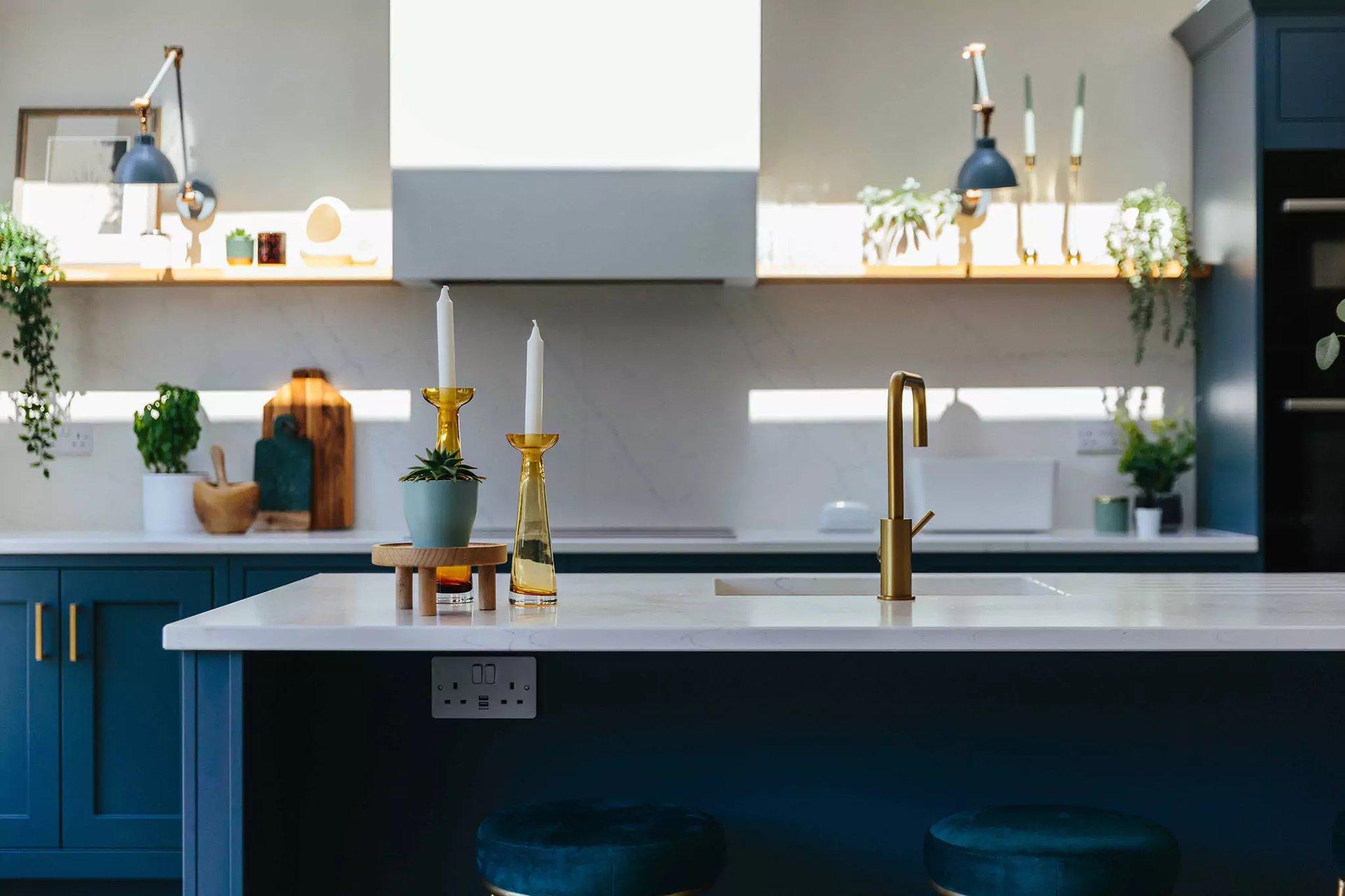
Image credit: My Bespoke Room
Contrast is key to a well considered interior room design as it keeps the space from looking dull and flat while also helping to highlight certain features in a room. Just think about how much more impactful a black vase looks set against a white wall compared to a very dark one.
Contrast is all about colour though. It can be light vs dark, shiny vs matte or rough vs smooth.
Lucy: “Quite often we see very little contrast in a space. It’s commonly seen in people’s homes that don’t really like colour or pattern. But there are so many different ways of adding contrast within a space, so just by adding texture and different materials and plants."
In a neutral scheme, natural elements can make a lovely contrast without being too overwhelming.
Want to discuss your design ideas with a professional? Book a free chat with one of our friendly designer today!
5. Following fads
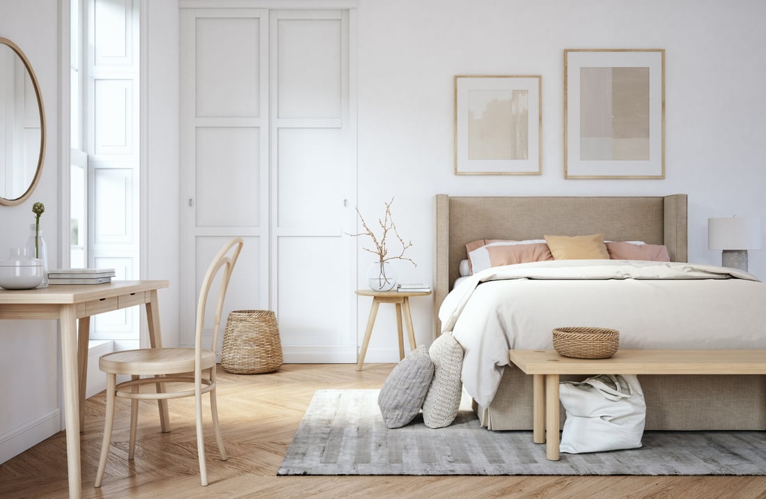
We love trends and watching how interior styles evolve over time. Interior trends adapt to our needs and wants; they are representative of what we, as humans, are more drawn to right now, what brings us comfort in day to day life and the direction of how interiors will cohabitate with people in years to come.
One of our biggest interior decoration tips is to be wary of the trends that could turn out to be bad interior design fads, because if you haven't fallen in love with the trend, you're just embracing it because it's 'cool' right now, then stop for a second before you go boucle bonkers or cover your home in botanical patterns. Do you actually love it?
'Trend' can be quite a polarising word, as we essentially jump to the conclusion that we're going to be told what's 'in' and what's 'out'. This definitely is not our motivation as we aim to design timeless interiors that will stand the test of time. Incorporate what's hot right now, if you genuinely think it is hot. Fads get a bad name - a misconception is that they're ugly. They're not, they're just often short-lived - just make sure you design your home in a style that you know you'll still love in 5 years time.
6. Bad lighting = bad décor
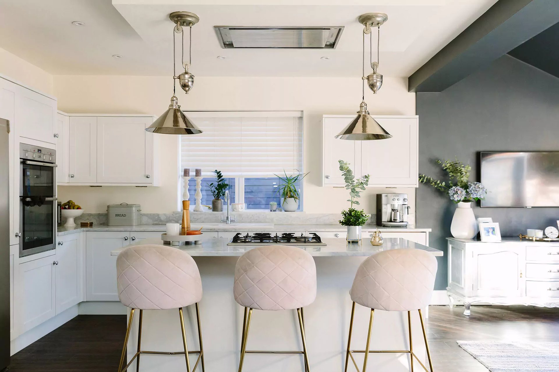
Image credit: My Bespoke Room
We see it time and time again as one of the biggest interior design mistakes: lighting being left as an afterthought. Really, lighting should be one of the first things that you consider when planning a home update as it really makes SUCH a difference. This works both ways - if you have fantastic lighting, it can transform a space, if it's a bit rubbish, your room is in danger of looking a bit rubbish too. Sorry, the truth hurts.
Our interior design advice is to layer your lighting. No, we're not saying lamps on top of lamps. We're talking about having lots of different light sources that have a different purpose, all working together to create a beautiful light scheme.
1. For example, start by making the most out of the natural light in the room; use mirrors to bounce the light around and make sure you're allowing an optimum amount of light coming in through windows/doors/any other glazing you may have.
2. Then, include your main light(s). Yep, the big one in the middle or the spotlights that are going to ensure the least amount of shadowy spaces. If you're installing new spotlights, think about the plan in which they're placed - do some areas of the room need more light than others?
3. Next is where task lighting comes in, this is the lighting that allows you to carry out, well, tasks. I.e. A desk lamp for a work space so you can see what you're reading or pendant lighting above the kitchen island for preparing food so you don't accidentally chop a finger off along with the carrots.
4. You've got all the essentials done, now it's time to add a little bit of a romantic, soft touch to your room with ambient lighting. These are your floor lamps for a reading corner, wall lights above a sofa or table lamps on a side table. These add décor, character and warmth, ensuring a cosy finish to your room.
5. Still not done? That's cool, we're not either. If you want to add even more lighting then you can add some decorative lighting - these don't really provide any other function that looking fab. Whether it's fairy lights in a children's room, small lamps or candles for shelving or fancy pants LED strip lighting in a coffered ceiling, it's going to add that extra WOW factor to your interior.
It's time to stop worrying about design mistakes! Book a room design with us from just £395:
7. A Feng shui nightmare
-2.webp?width=1100&height=716&name=Post%20image%20landscape%20(95)-2.webp)
Image credit: My Bespoke Room
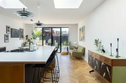
Walls don't have magnetic forces that pull furniture towards them, so you don't need to plan your layout like they do. You have the entire space to play with, so please don't feel restricted to pinning furniture against the walls - in fact, we suggest that you don't.
The room will feel larger and more spacious if you create more walkways by centring your furniture or creating a couple of zones with furniture and rugs, depending on the size of your room. This is especially important in open and broken-plan spaces.
We know that there are many interior problems that mean furniture has to be against the wall and looks the best this way. However, this doesn't mean you can't have a central coffee table and an accent chair or two that 'float' within the space.
With this in mind the entire space will have that best interior design feeling that would be good enough to be featured in Elle décor!
Check out our blog on creating the perfect open plan space that will grow with you and your family.
8. Extreme budget buying
-2.webp?width=1920&height=1250&name=Post%20image%20landscape%20(100)-2.webp)
Image credit: My Bespoke Room
We all love a bargain and it's amazing how luxurious and classy a lot of budget buys can look, especially when styled well. However, sometimes pricier items have that price point for a reason - they're just stunning. Whilst, you can update most of the home on a pretty reasonable budget, especially if you're a fan of rummaging in second-hand shops, DIY and up-cycling old furniture pieces, you should allow yourself a one-off splurge every once in a while.
One very special item can really transform an interior, immediately lifting the décor of the entire room. Additionally, a special purchase instantly attracts attention and, if a furniture item, can act as a centrepiece.
If you need help avoiding expensive mistakes and creating a home you love, book a free, no obligation consultation with an Interior Designer to discuss your project:
9. Not-so-wall of fame
-2.webp?width=1920&height=1250&name=Post%20image%20landscape%20(97)-2.webp)
Image credit: My Bespoke Room
Hanging art is a tricky skill to master because there isn't a set of simple rules to follow - this is an area of interior décor is where you can really let your creative juices flow. Whether it's a symmetrical tryptic of frames, an eclectic gallery wall or a statement canvas, you want to get the spacing and height right.
As a simplified rule of thumb, we recommend you hanging the wall art at roughly eye level - too high or too low can look a bit odd. When you're creating a gallery wall, we recommend a minimum of 10cm between frames. If you're hanging art above furniture such as a sofa or a console table, make sure the artwork is central above or balanced with other furniture and finishing touches within the room.
10. Small space doesn't mean small design
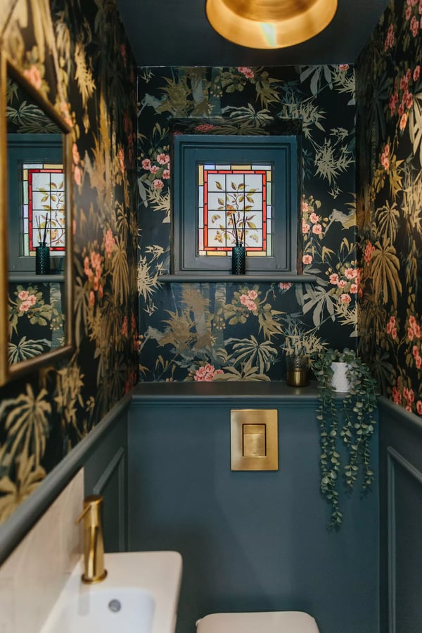
Image credit: My Bespoke Room
If you have a small room and think it's too small to look beautiful, then tell yourself off. Every room deserves TLC and small spaces are often where you can have the most fun!
One of the most common decorating mistakes to avoid is fighting with your small room, trying to make it look light and bright if it's actually naturally quite dark and dull. If this is the case, then embrace it. Paint the room dark or go for a bold and dramatic wallpaper. Don't be afraid of pattern because it's 'too busy for the space', 9/10 times it won't be - as long as you don't have patterned flooring, a wall mural and every other wall wallpapered.
If your small room actually benefits from a lot of light, then make sure you try your best to emphasise this. Use light furniture made out of natural materials and large mirrors to bounce light around the space.
Looking for help designing a home you love and are proud of? Start filling out our design brief today!
11. The wrong rug
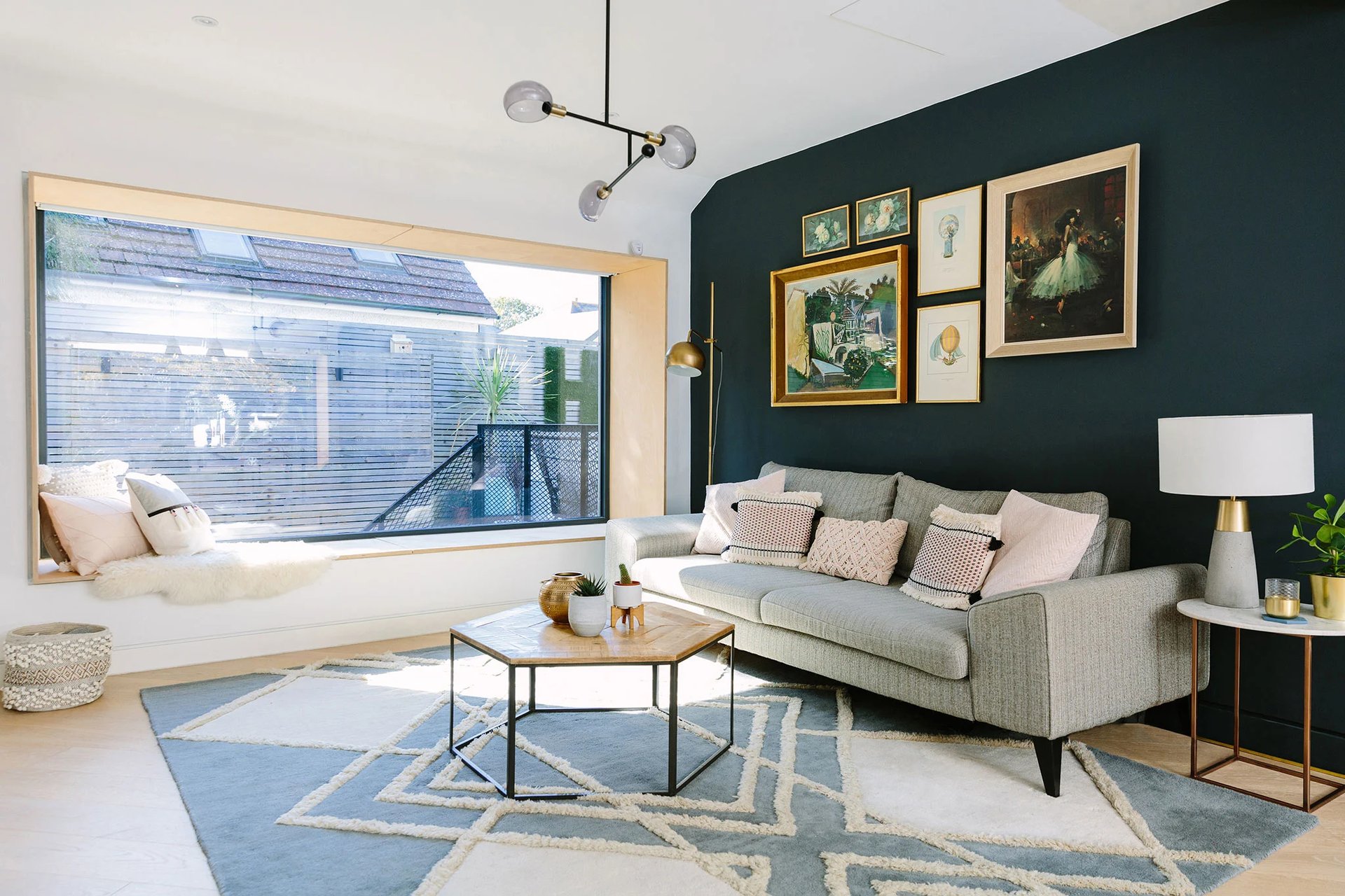
Image credit: My Bespoke Room
A rug should be a large part of your room décor, therefore an important part to get right. We have listed some interior decorating advice to follow so you hopefully don't make any expensive interior design mistakes, and get it right first time!
For living rooms:
1. Take it right back. In smaller spaces, the layout of your living room often includes a sofa against one wall, and the TV and/or fireplace sat comfortably on the wall opposite. Putting a rug closer to the 'sofa wall' bounds the layout and makes the seating space feel cosy and warm, whilst creating a walkway space between the fireplace or TV unit, therefore not inhibiting any access.
2. Stand alone. We LOVE a large rug, but if your budget doesn't allow an XL purchase or you have an unassigned smaller rug that you can't part with, don't worry, that can look great too! A smaller rug (usually about 130x180cm), can frame your coffee table creating symmetry and grounds your table, making it a centrepiece in the room. If you do go for this look, just make sure that neither sofa or armchair legs sit on either side of the rug.
3. Use your rug to ground your furniture. Place all the main, central living room furniture, i.e. sofas, additional seating and coffee table, on top of a large rug to make a room feel super snug and also, really quite lavish. The rug zones the living space, adds warmth, colour and pattern and pretty much creates the layout for you - what a little multi-tasker!
4. Just add legs. Depending on the space, this still involves a pretty large rug. Place the front legs of your sofas and chairs on the edge of the rug, so about half the depth of the sofa sits above the edge of the rug. This still has all the benefits of the above, but you don't need such a large space to execute it.
For bedrooms:
5. Frame the bed. Who doesn't want their room to feel ultra cosy? Make your room as snug as a bug in a rug by placing a large rug beneath the bed, just in front of your bedside tables so that the majority of the bed sits above the rug. Ideally, you should have a minimum of about 50-60cm of uncovered rug at the end of the bed to really see (and feel) the benefits. For a standard double bed, a 200x300cm rug would be a safe bet.
6. To the side. We know what you're thinking. What if your bed isn't central in the room? No middle point, no problem. A sheepskin rug, a runner or a smaller, standard sized rug (130x180) can sit next to your bed. This gives you a soft step when you groggily pull yourself out of bed in the morning, or a soft landing if you're one of those 'jump out of bed every morning' people - if you are one of those people, please tell us how do you do that?!
For children's rooms:
7. Playtime space. Children are smaller humans, and in turn, children's rugs are often smaller sizes. They're a great way to add colour and fun to your little one's interior room design, but also fab for creating a dedicated play area.
8. A calming addition. As well as playtime, kids need chill out time too. Add a fluffy sheepskin, or deep pile rug next to their bed to make the room feel relaxed and comfortable. Just don't get a rug so soft that they fall asleep on the floor and not in their beds!
Our designers will find you furnishings you love that are within your budget! Book a room design today and start transforming your home:
12. When you don't remember to measure
-2.webp?width=1100&height=716&name=Post%20image%20landscape%20(99)-2.webp)
Image credit: My Bespoke Room
This is a simple piece of interior design advice and we won't spend too much time on it: PLEASE remember to measure your room and furniture to make sure everything fits like a glove.
There's not much worse in the realm of interior design mistakes than falling in love with a piece of furniture, buying it and then realising that it is either too big or too small.
Get a tape measure out, use an app or even a laser measurer and do get those dimensions done!
Check out our measuring guide if you need a bit of help.
13. How's it hanging
-1.webp?width=1920&height=1250&name=Post%20image%20landscape%20(92)-1.webp)
Image credit: My Bespoke Room
Hanging curtains too low can make the walls look shorter and the finished look a bit cheaper. Also, if it's practical, we recommend having floor length curtains even if the glazing isn't down to the floor - this gives a more luxurious and cosier finish.
As a rule of thumb, if you hang your curtains higher and there is a long length of fabric, your room will look taller. This is an important interior decoration tip to avoid later problems.
Still debating whether our service is right for you? Book a free call with one of our expert designers to discuss your space:
14. When finishing touches get forgotten
.webp?width=600&height=800&name=Portrait%20(38).webp)
Image credit: My Bespoke Room & Da Silva Design
How many times have you completed the big tasks of a project, yet the final touches have always been pushed to the bottom of your to-do list?
The soft furnishings, artwork, indoor plants and accessories are what complete a design and makes the room feel like home. Avoid buying things just for the sake of it, only buy things you genuinely like - it's kinder to your home and to the environment. Frames, vases and cushions are a great way to pull together a colour scheme and give a cohesive finish - these are the final interior design tips and tricks that can make all the difference!
15. Feeling obliged to keep hand me downs
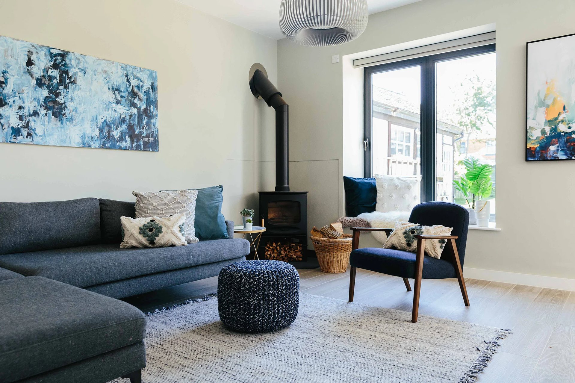
Image credit: My Bespoke Room
Ok, as kind as it is for your grandma to give you that 30+ year worn leather recliner sofa (no amount of up-cycling could bring it into the 21st century) and as much as we go on about using existing furniture to be more sustainable, sometimes, it just won't work.
Don't compromise your style and design to try and incorporate an item of furniture that, to be brutally honest, is never going to look good. Yes, practicality is important, but you want to like the look of your home too! Use the hand-me-down as a transitional piece of furniture whilst you're out there looking for your perfect, cosy seat.
If you need help creating a home you love, book a free, no obligation chat to discuss your project with an Interior Designer:
16. Ignoring 'less is more'
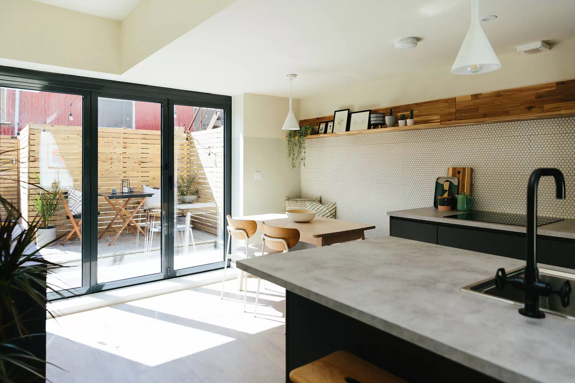
Image credit: My Bespoke Room
There's no smoke without fire and no one said 'less is more' without good reason. Try not to overcomplicate your home update by squeezing in too much furniture or creating clutter that isn't necessary. Think about what you absolutely need, start there, and then consider what you want after. This makes it easier to prioritise and keep clutter to a minimum.
Sometimes avoiding interior design mistakes is all about remembering good vs bad interior design often comes down to simplicity. Tidy home, tidy mind!
17. Pure brilliant white
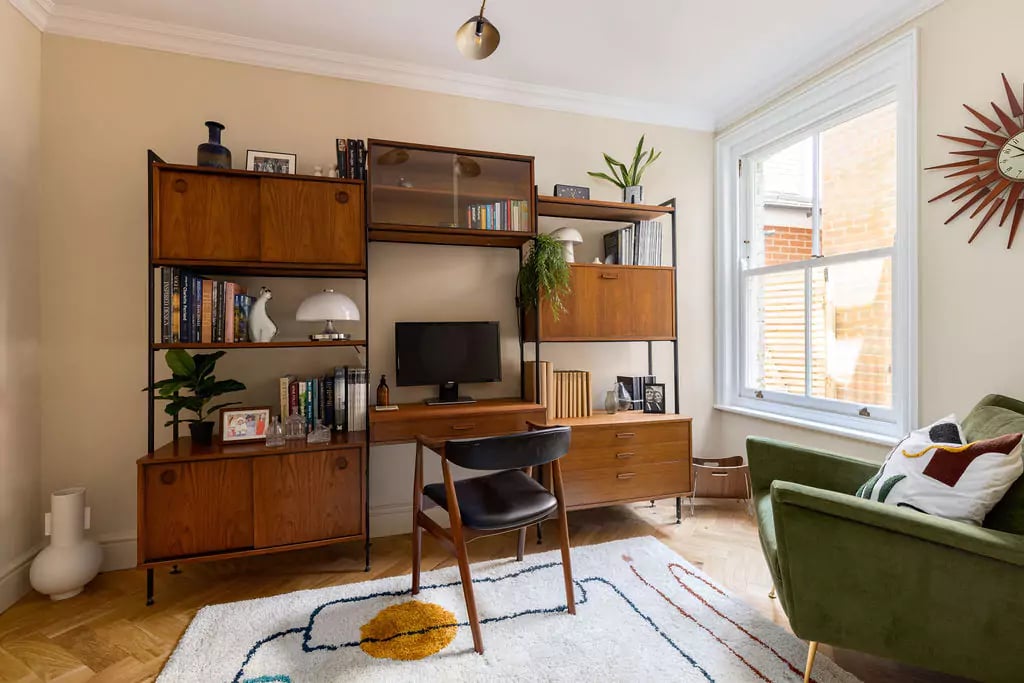
Image credit: My Bespoke Room
We love white, light and bright interiors (yep, we rhyme as well as design - oops there we go again). However, in the world of interiors there isn't just your 'pure brilliant white' available on the market.
Sometimes, if you just have your plain white walls, the room can look a bit cold and clinical. There are so many 'off-white' shades to consider - some are warmer, with red or yellow undertones to give a softer, creamier look, others have purple or blue undertones that give a more grey finish.
These off-white shades are the unsung heroes of interior design problems because they can add depth, warmth and atmosphere to your room before you have even started with the furniture.
If you need help avoiding expensive mistakes and creating a home you love, book a free, no obligation consultation with one of our expert designers to discuss your project:
18. Falling into the trap of matching furniture sets
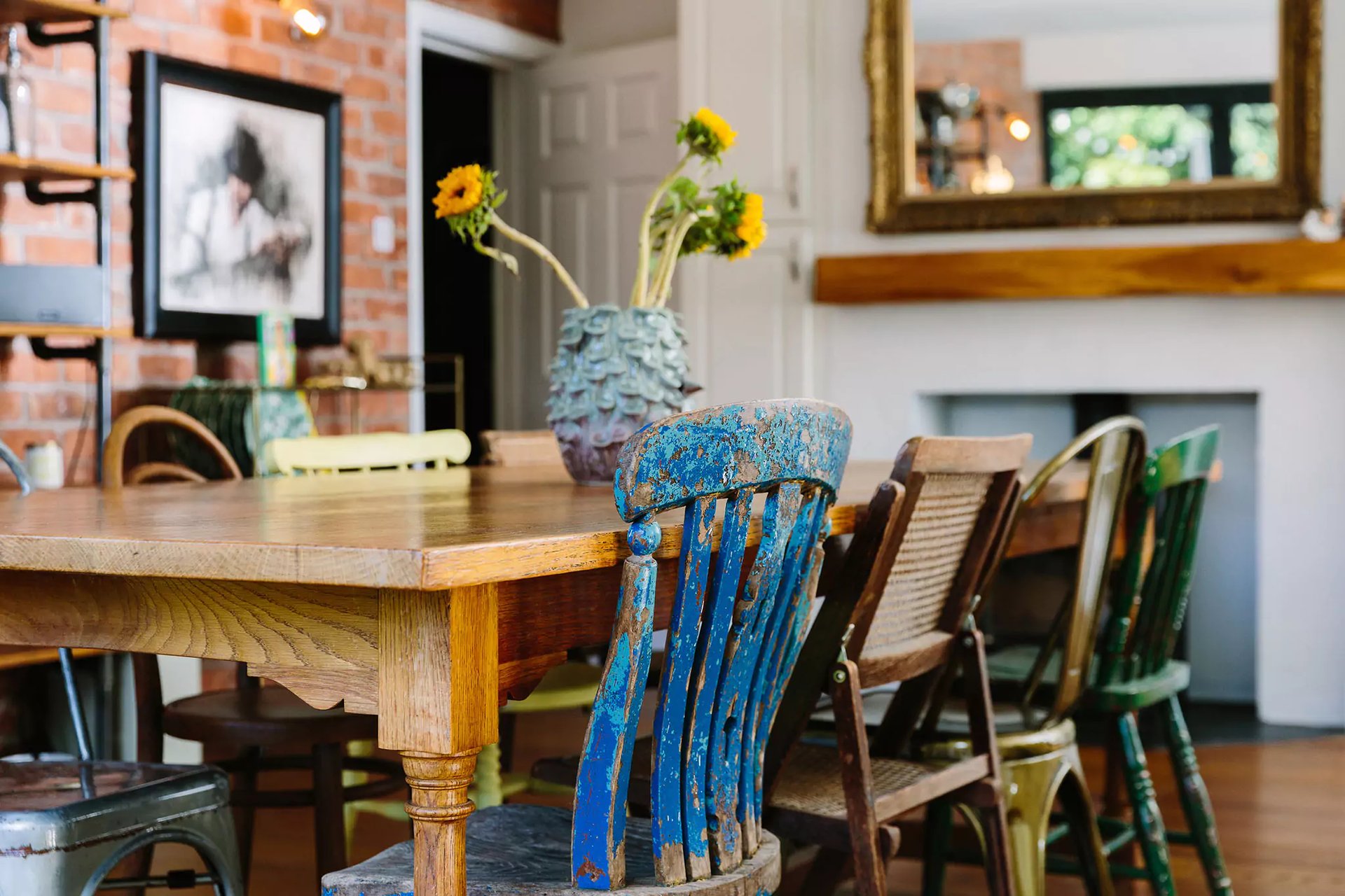
Image credit: My Bespoke Room
Of course we would like our home to look coherent and everything to look good together. The fear that the finished design won't look cohesive allows people to fall into the trap of matching furniture sets, everywhere.
There's nothing wrong with a dining table and matching chairs, nor is there a problem with a sofa and matching armchair. However, sometimes these sets would benefit from being broken up by a couple of different chairs, or the same style sofa in a different fabric. This way, you can avoid bad interior design choices and make your home look less like a furniture shop showroom and more like your unique home oozing with personality.
Are you ready to transform your home? Start filling out our design brief today!


.png)





.png)


 Subscribe

-1.png?height=300&name=Untitled%20design%20(16)-1.png)
-2.png?height=300&name=Untitled%20design%20(15)-2.png)